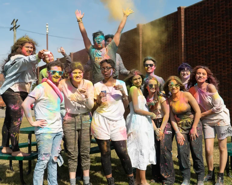
Elevating the Future of the VA
We promise to champion your story, nurture your journey, and guide your next chapter.
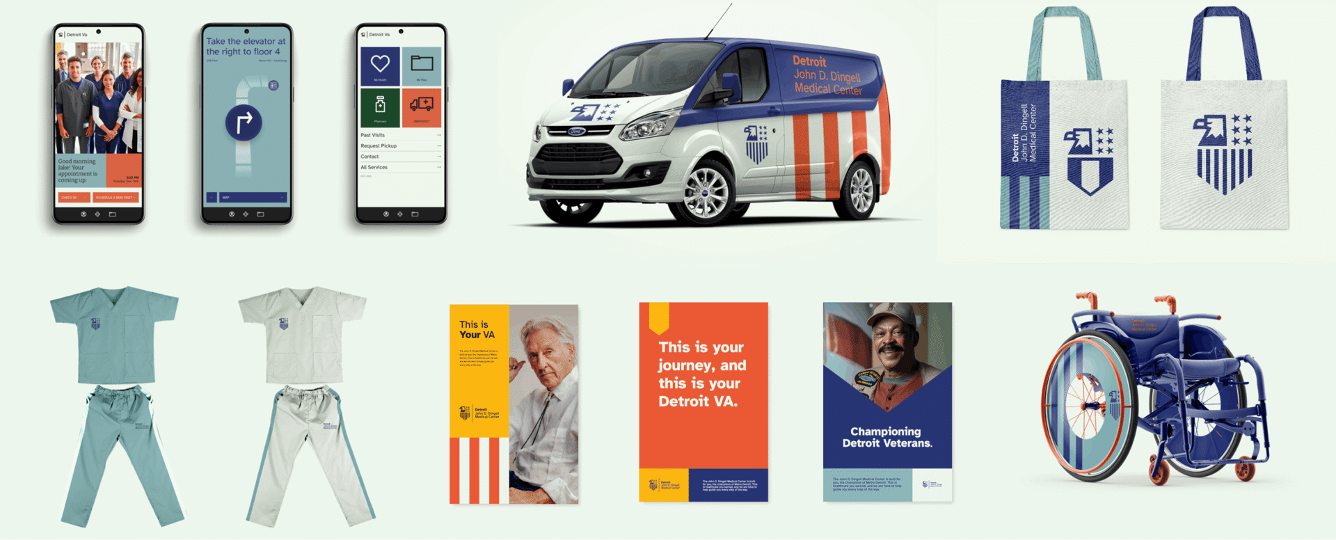
Over the course of 15 weeks, our group designed a bold and adaptable rebrand to elevate the future of the VA while still respecting the pass. We conducted interviews with key stakeholders, patients and staff, researched the history of the VA, and went through multiple phases of iteration. This project presents the result of our work by highlighting our brand system.
Client
Detroit John D. Dingle Medical Center
Team
Whitney Hockman, Julian Dalat, Ian Bishop, Brianna Powers
We began with extensive research on the current VA’s branding, and after, created a set of personas to help inform our decisions.
We promise to Champion your story—
Nurture your journey—
and Guide your next chapter.
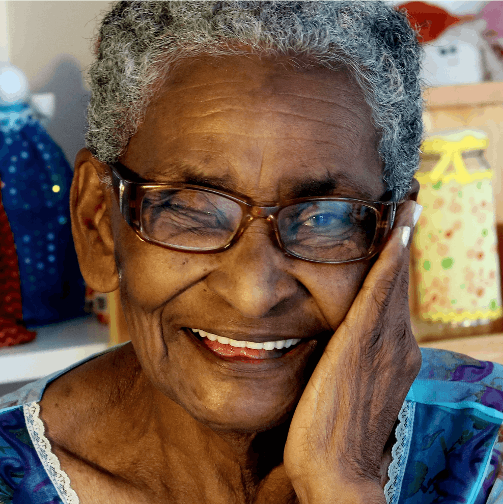
Mary Johnson
Veteran Caregiver
Mary’s Husband is an Army veteran and Mary helps him with scheduling, and accessing VA services.

Marcus Wright
Veteran
Marcus is a new veteran, who is navigating the process of utilizing VA services.
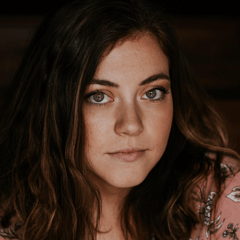
Emily Thompson
Volunteer
Her Grandpa is a Airforce Veteran, and Emily wants to find a way to give back to heroes like her Grandpa who served our country.
Our goal was elevate the current VA’s branding, while respecting the past.

The Stars represent the 6 branches of Military
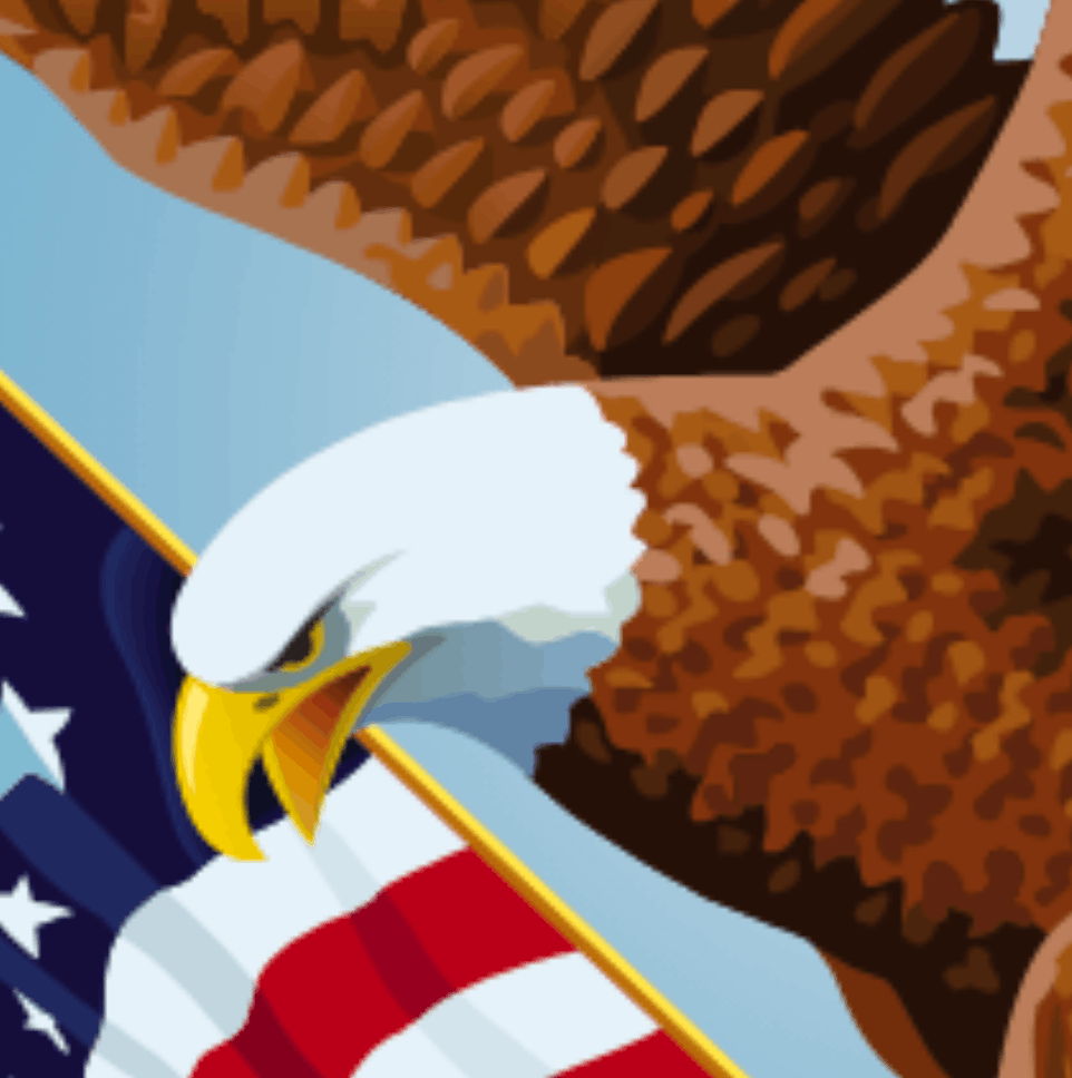
The Eagle represents freedom, strength and patriotism
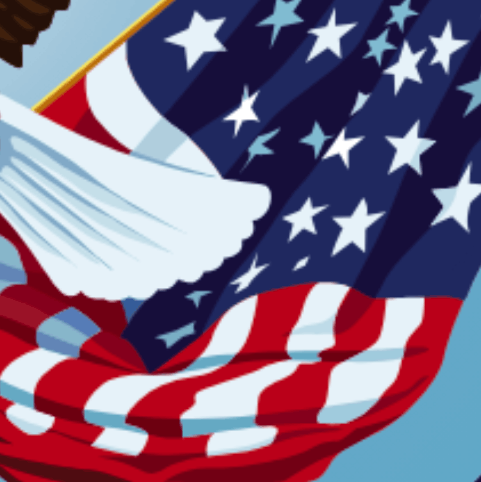
The Flag represents our nation’s commitment to its Veterans
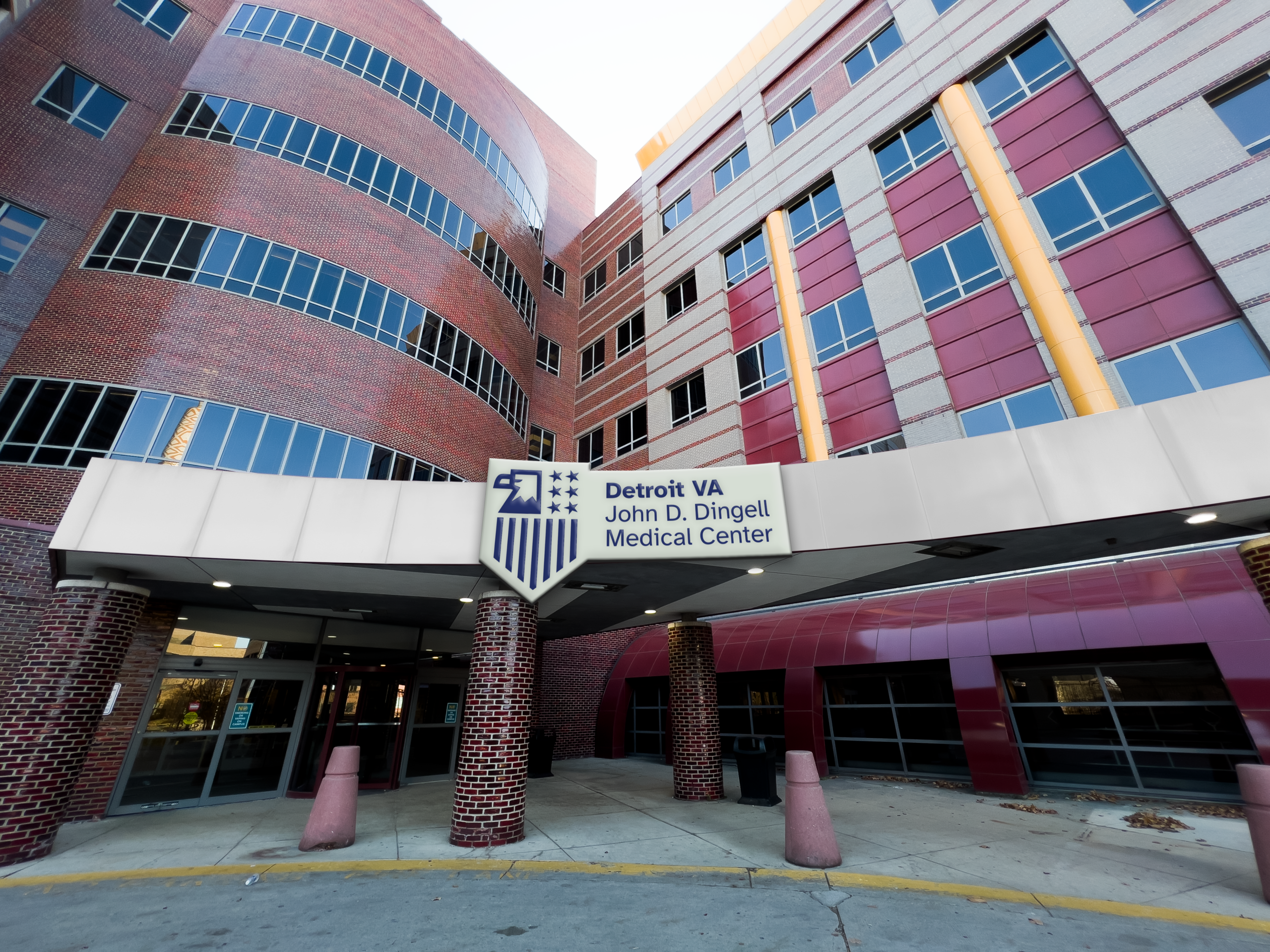
With these elements in mind, a new elevated bold mark was created to represent the VA.
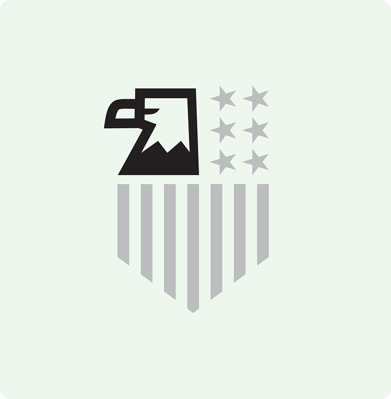
Champion
The Eagle represents the veterans— champions who utilize the VA’s services.
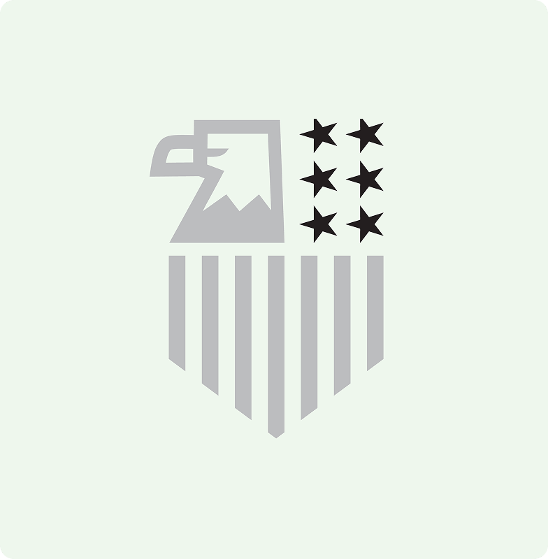
Nurture
The 6 stars represent the 6 branches of the military. They are connected together to show that the VA nurtures all veterans.
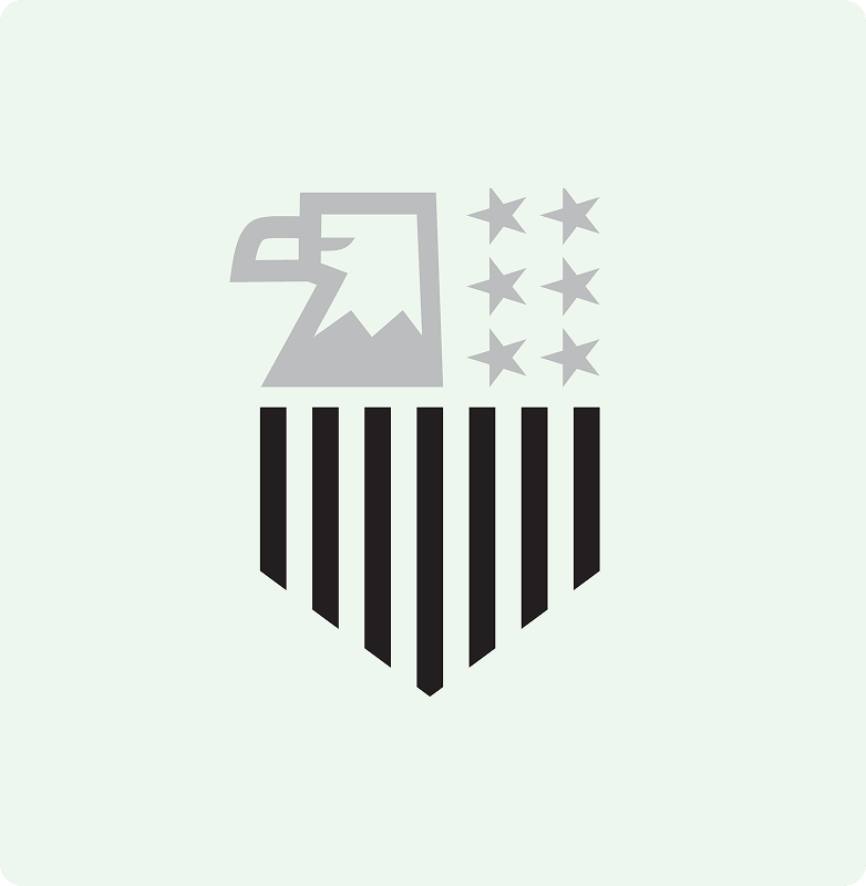
Guide
The lines reference the American flag, symbolizing how veteran’s lives are guided with freedom and liberty.
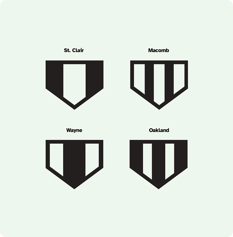
Seals
The Guide part of the seal can swap out with badges that coordinate to the counties served by the Detroit VA.
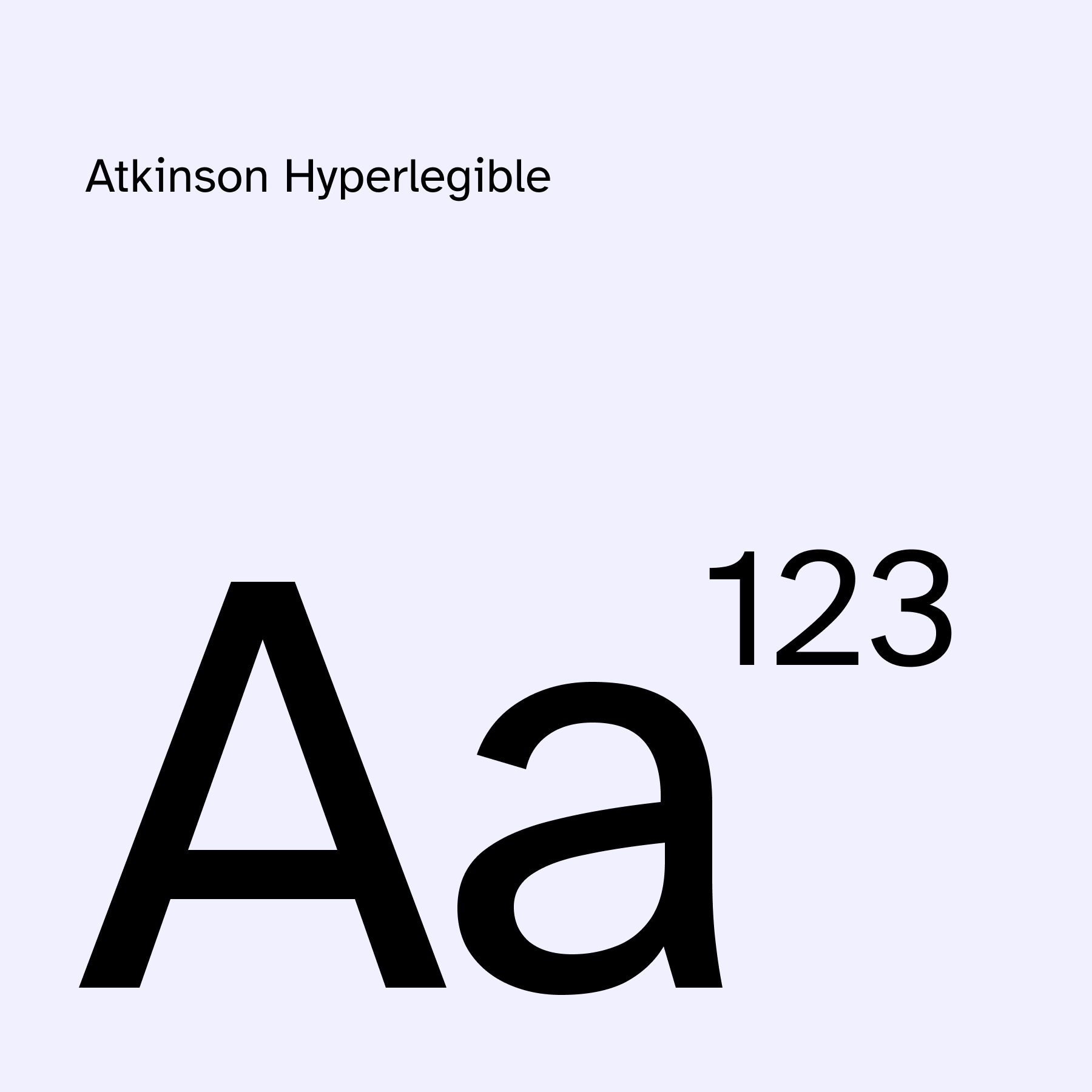
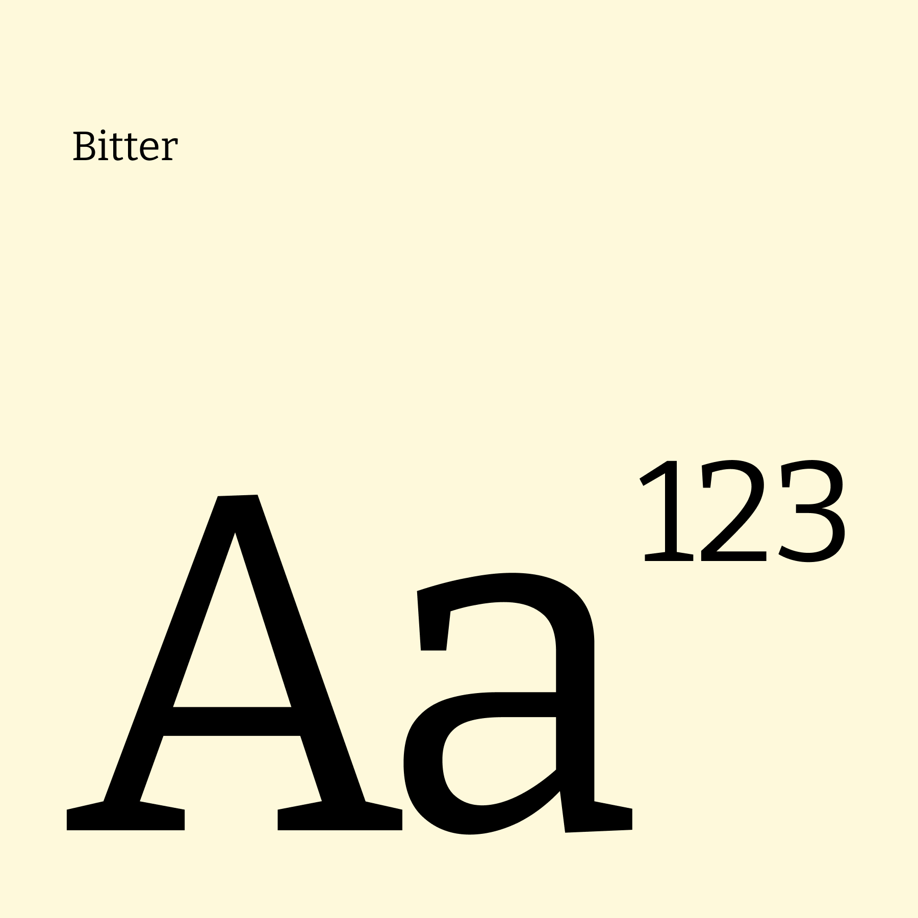
For Typography, Atkinson Hyperlegible was chosen as the primary typeface for it’s strong accessibility; specifically designed for people with low vision, making it highly readable. Bitter was chosen as a secondary typeface, also designed for readability, the strong serifs naturally compliment Atkinson Hyperlegible.
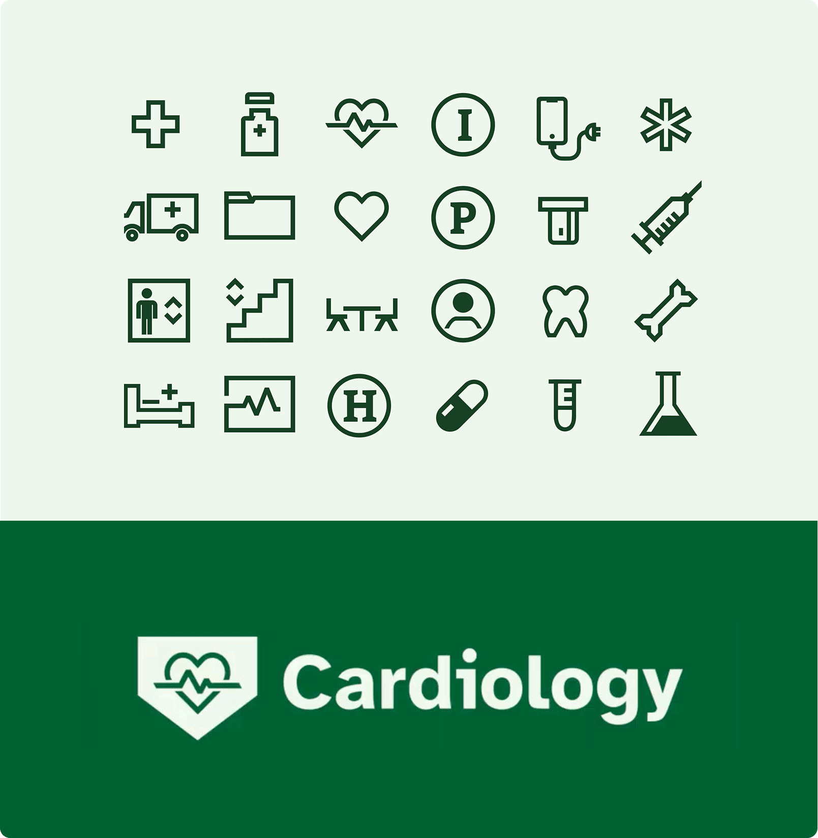
An icon system was created, and inspired by the drawing of the type and eagle. Bold and recognizable to help visually guide veterans through the VA.
Icons can easily be adapted into the badges created for the seal.
This helps create consistency throughout the brand.
We chose to keep the blue that the VA currently uses. We recognized many patients were already familiar with this color and we wanted to build on that. We brought in Black and White for legibility and contrast.
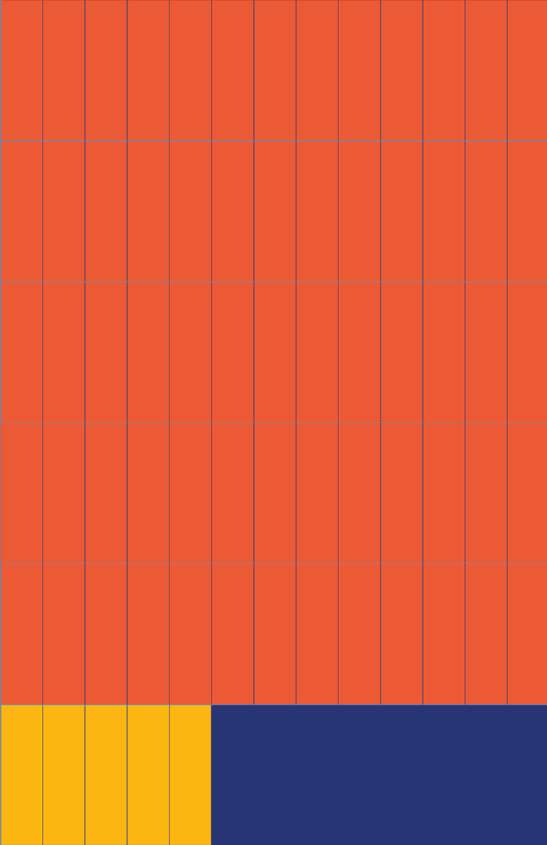
The colors are used extensively in our grid system, where we employ color blocking to easily highlight information and create bold composition.


The result is an easily adaptable grid that works for photos, text, and more bold applications using the badge as a framing element.

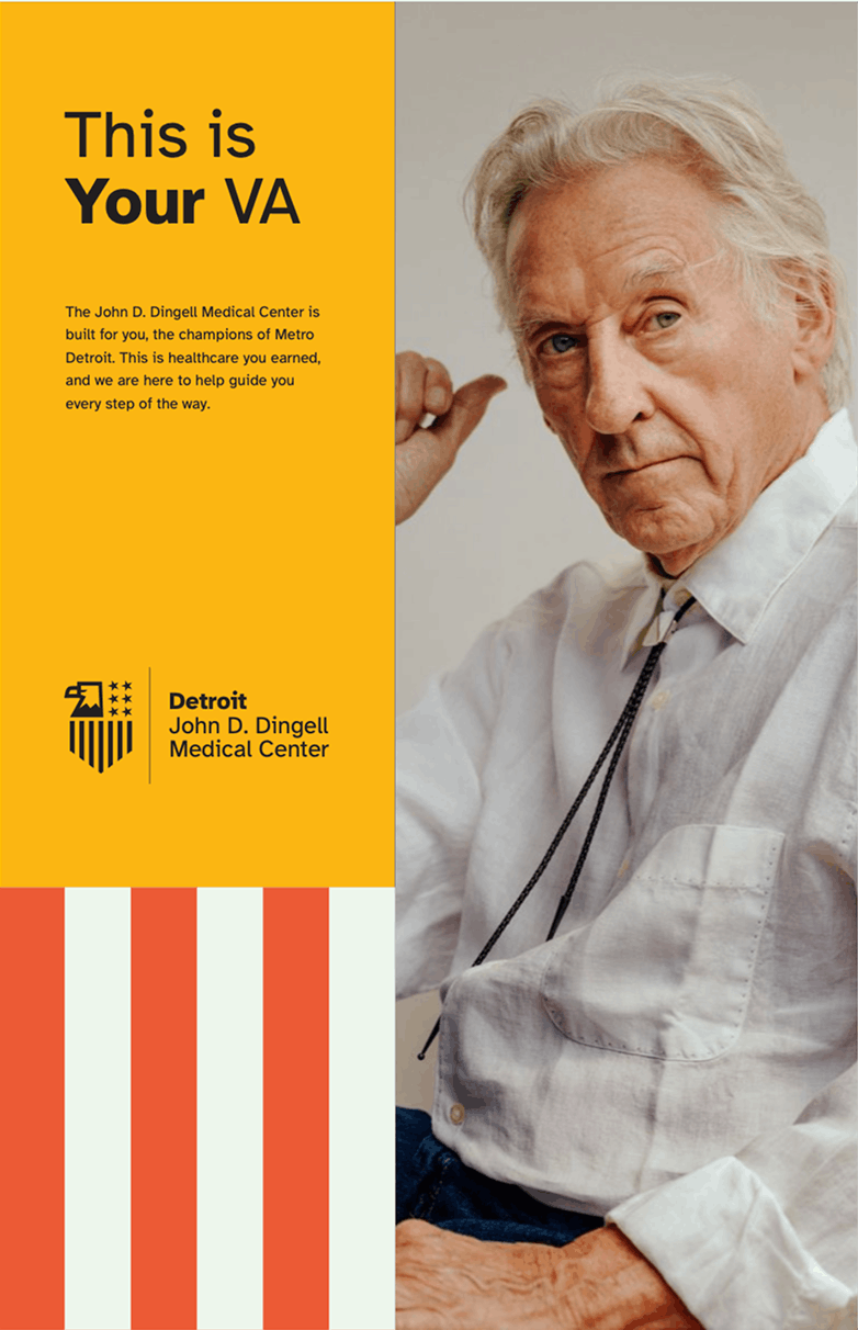
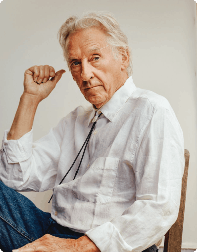
The photos used in our brand highlight veterans with bright and clear headshots, as well as candid moments. All photos featured veterans in clear lighting. We also utilize a naming system to make sure we properly honor all the featured patients.
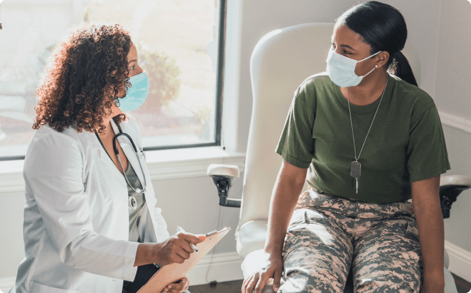
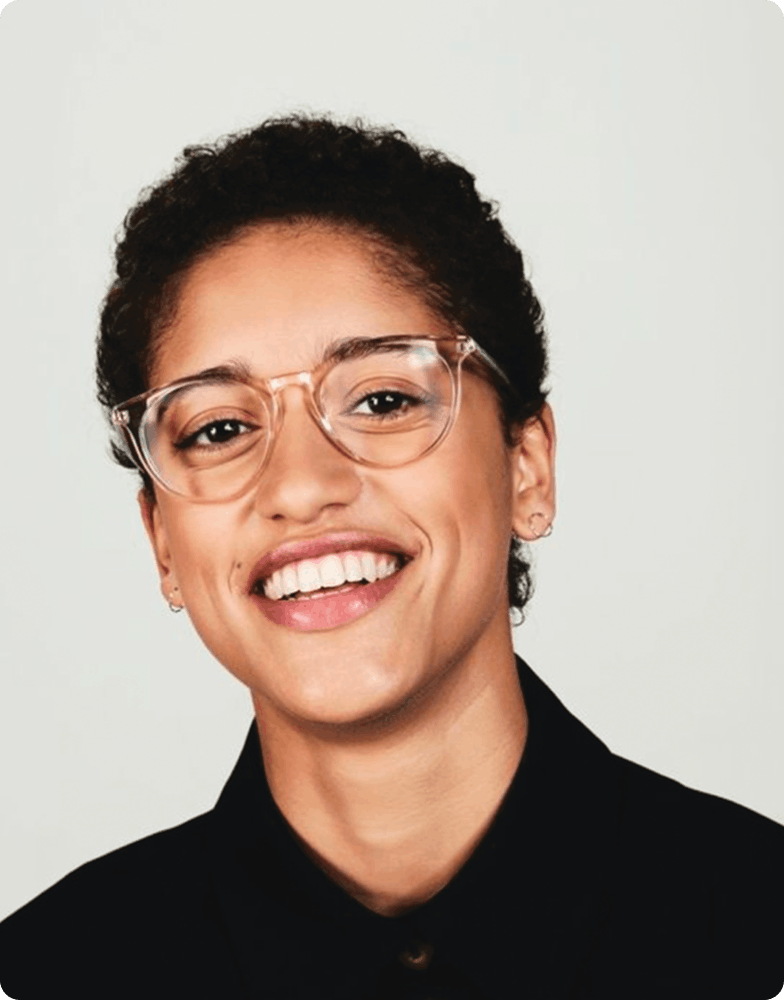
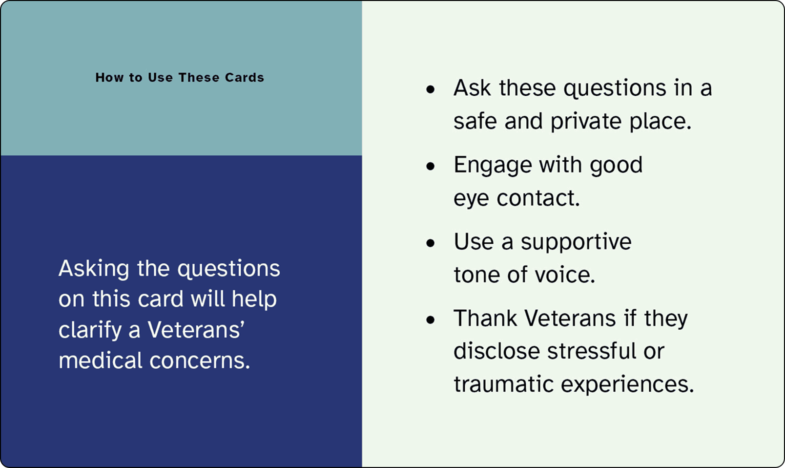
We continued this line of thinking with our language, creating language that attracts people to the VA, and language that directly relates to our essence words—Champion, Nurture and Guide.
When it came time to apply our brand, we knew we wanted to make it easy for veterans and their support systems to access VA services.
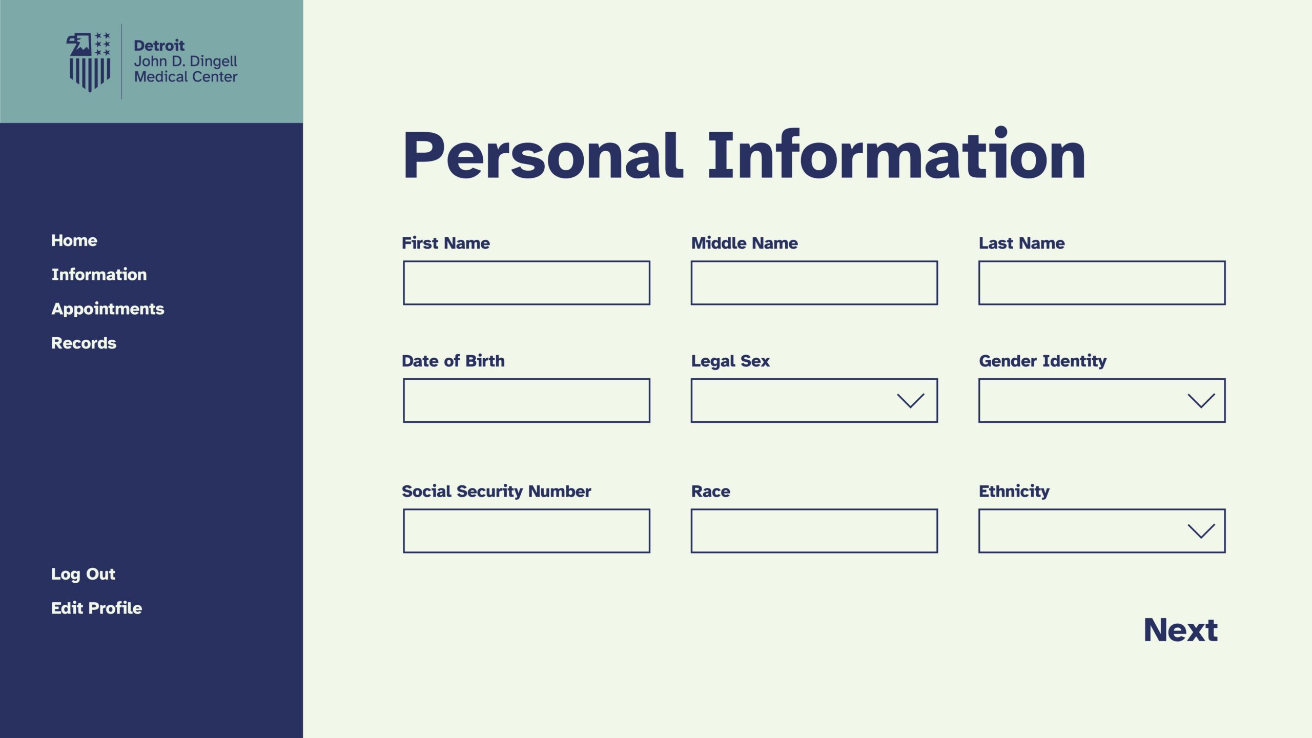
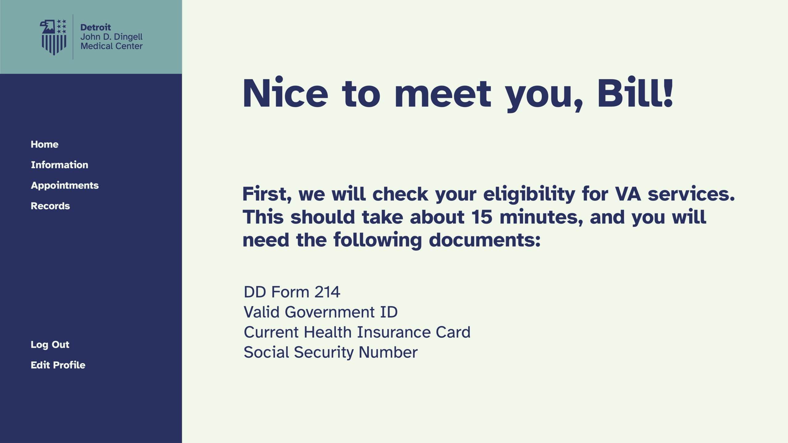
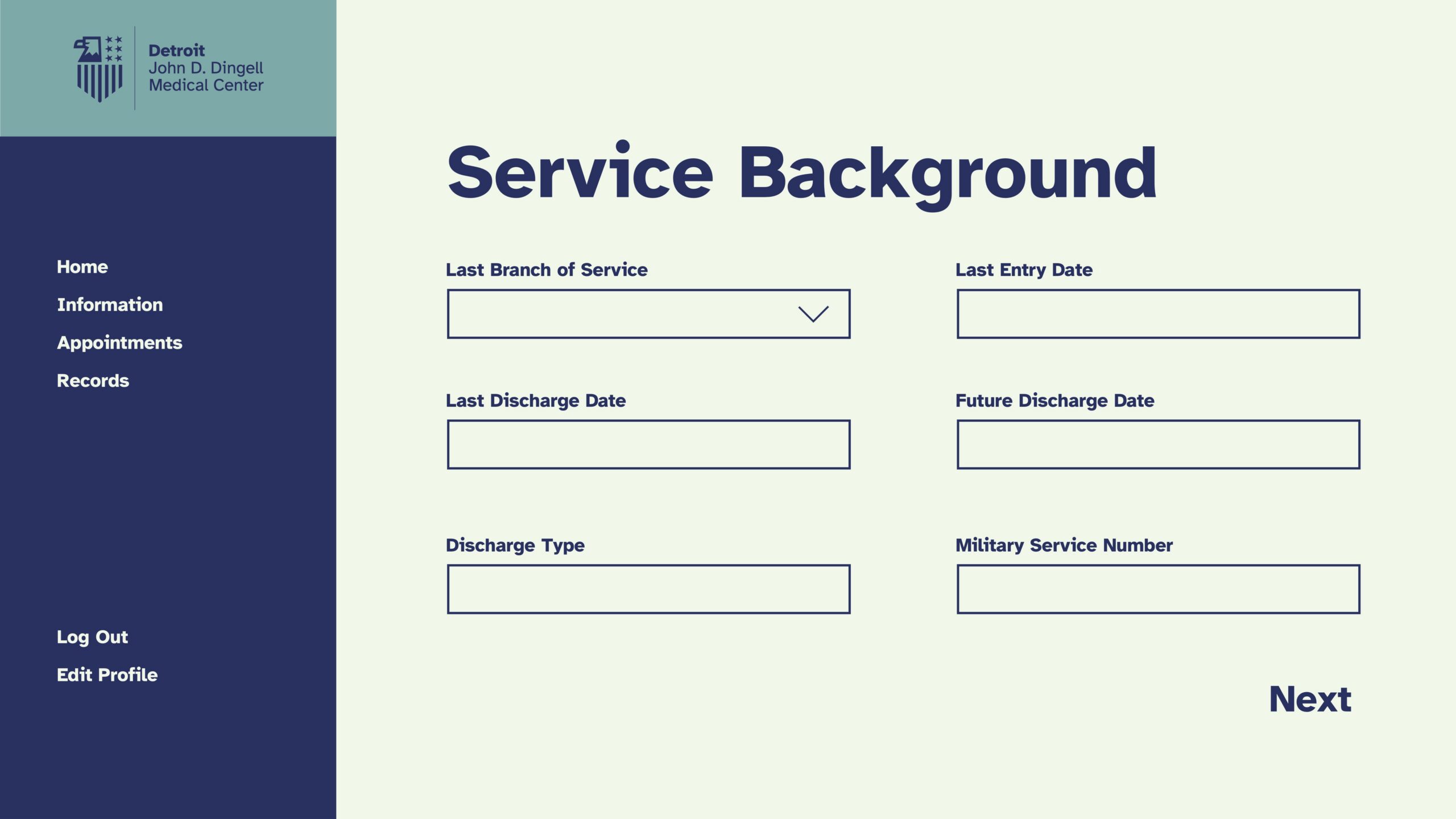
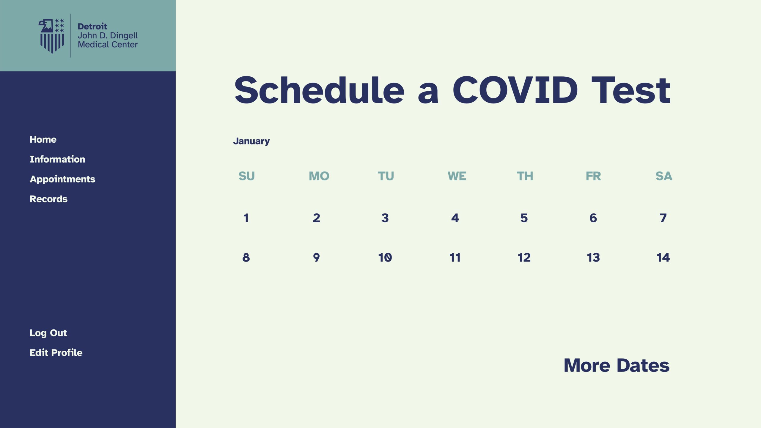
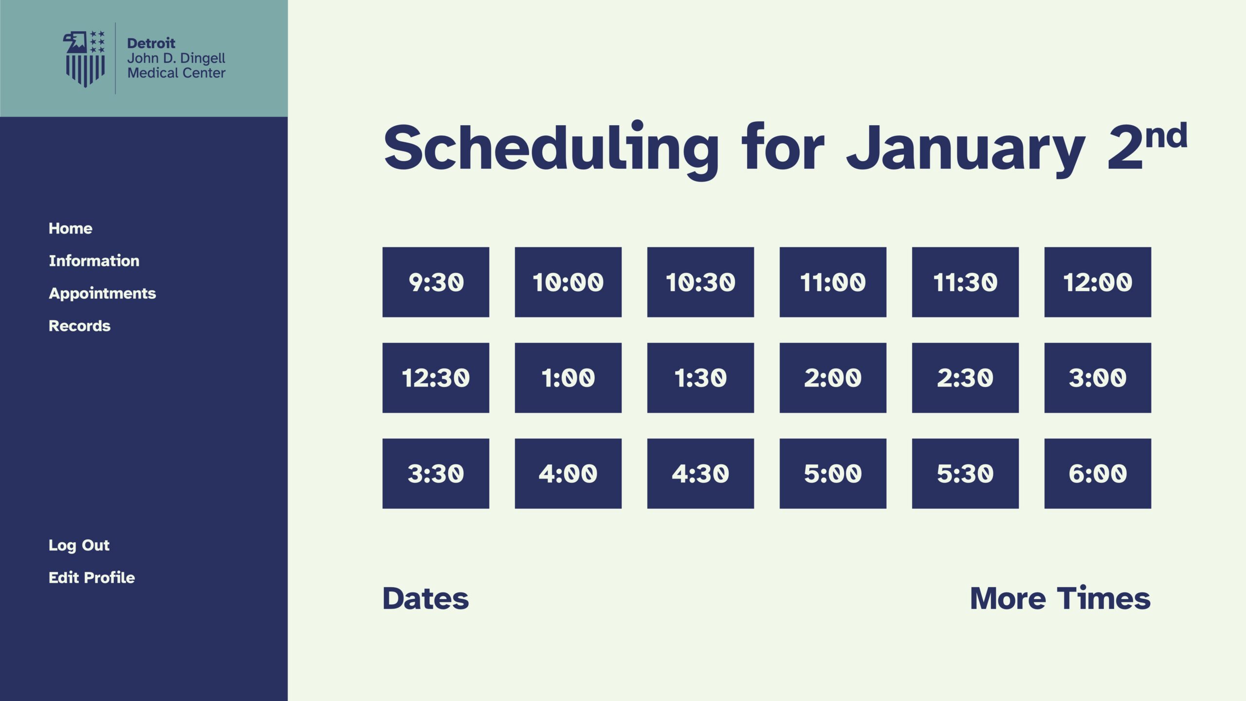
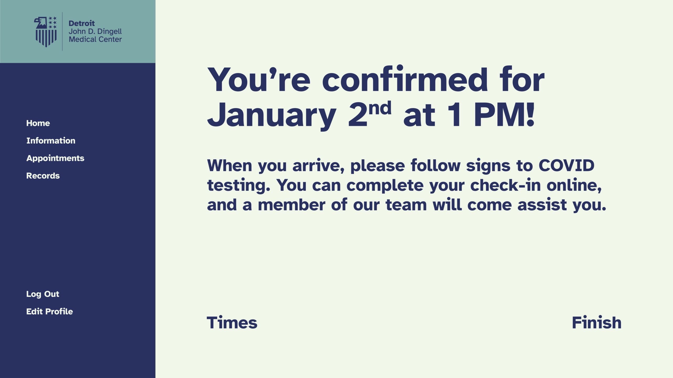
Patient Portal
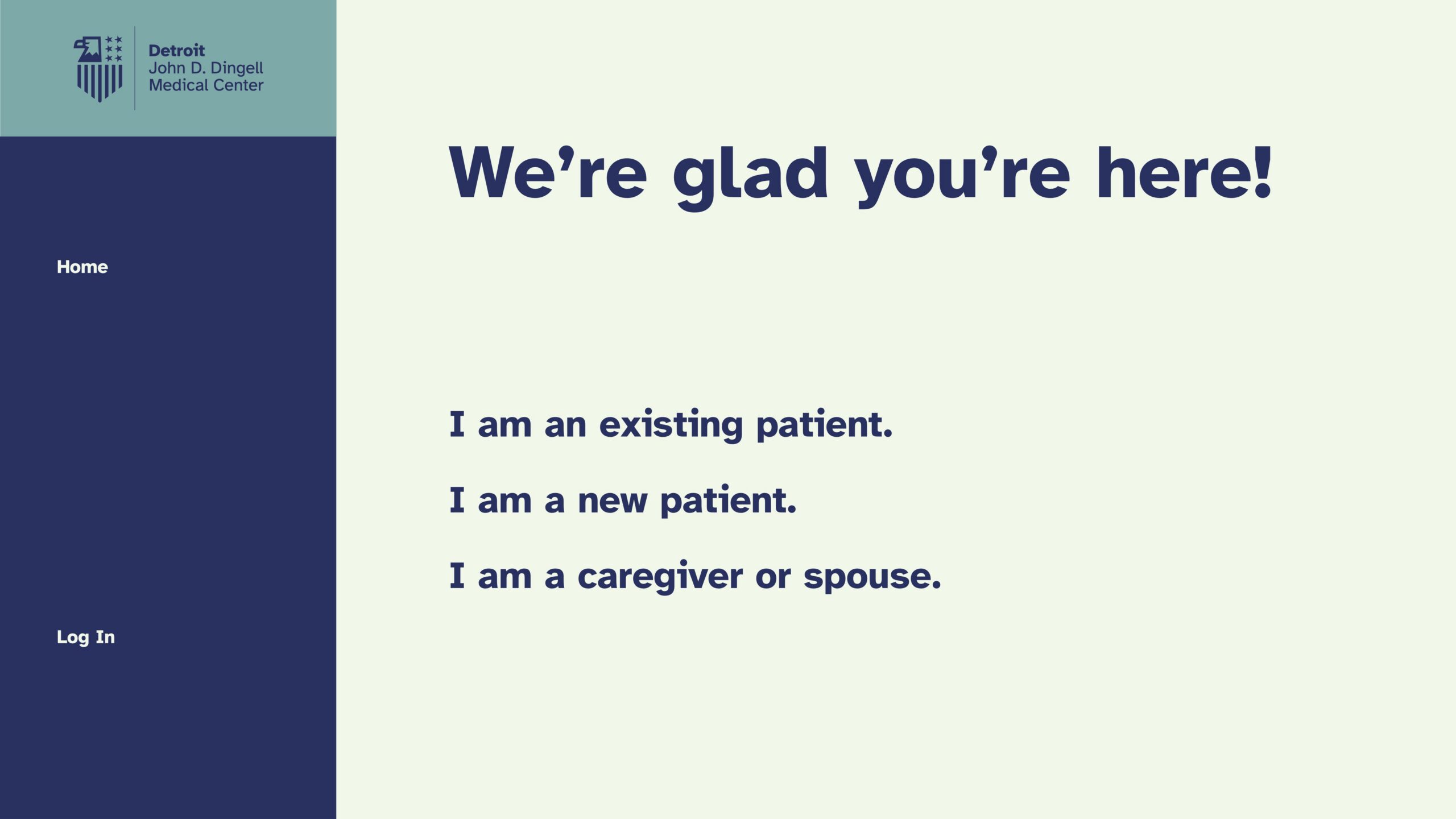
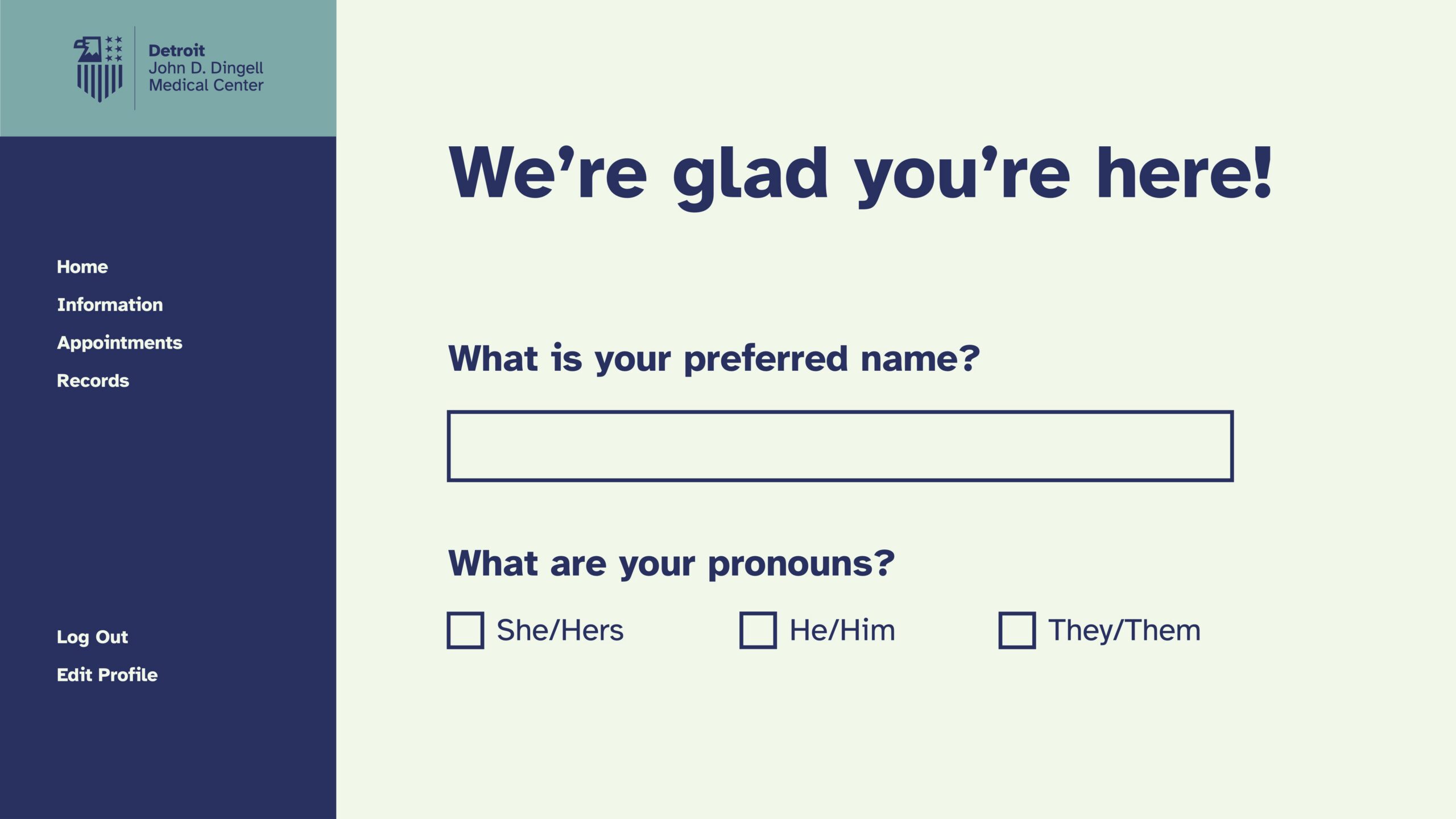
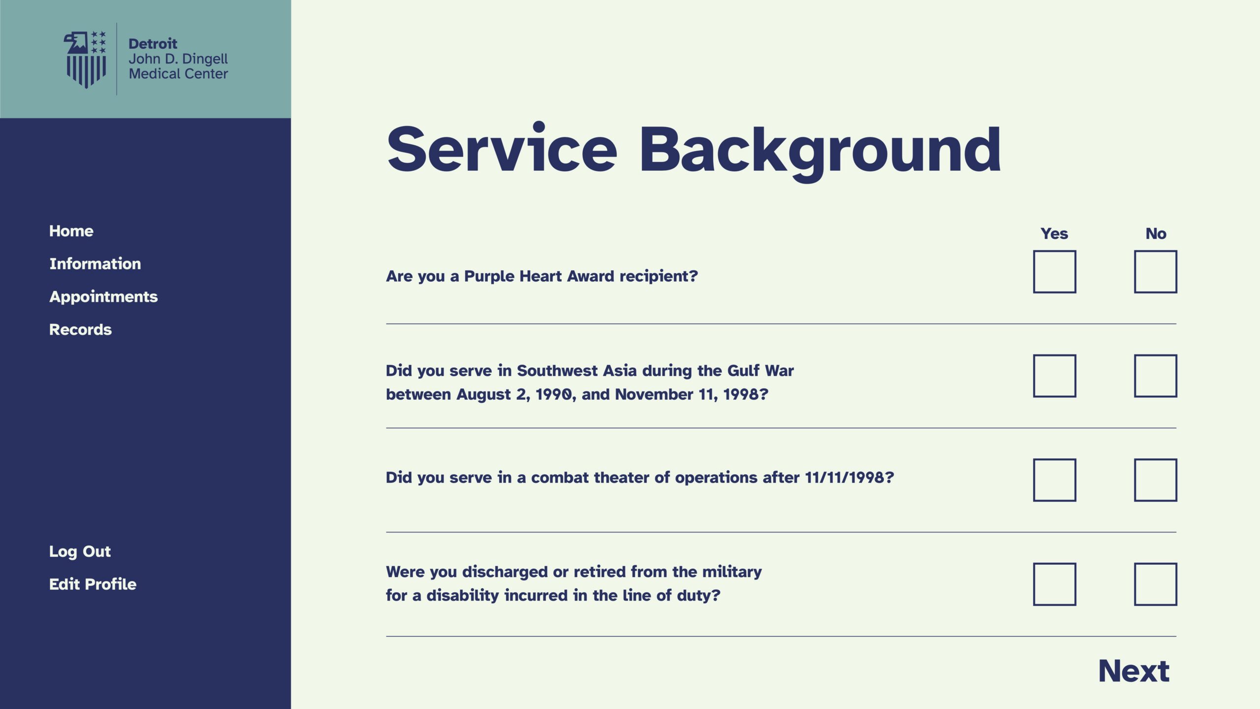
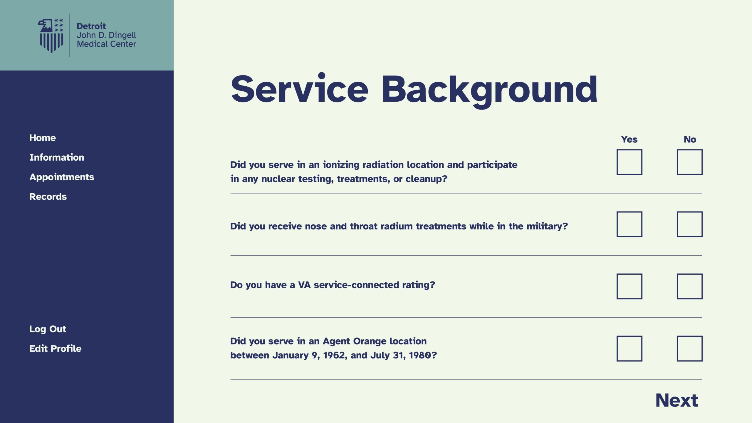
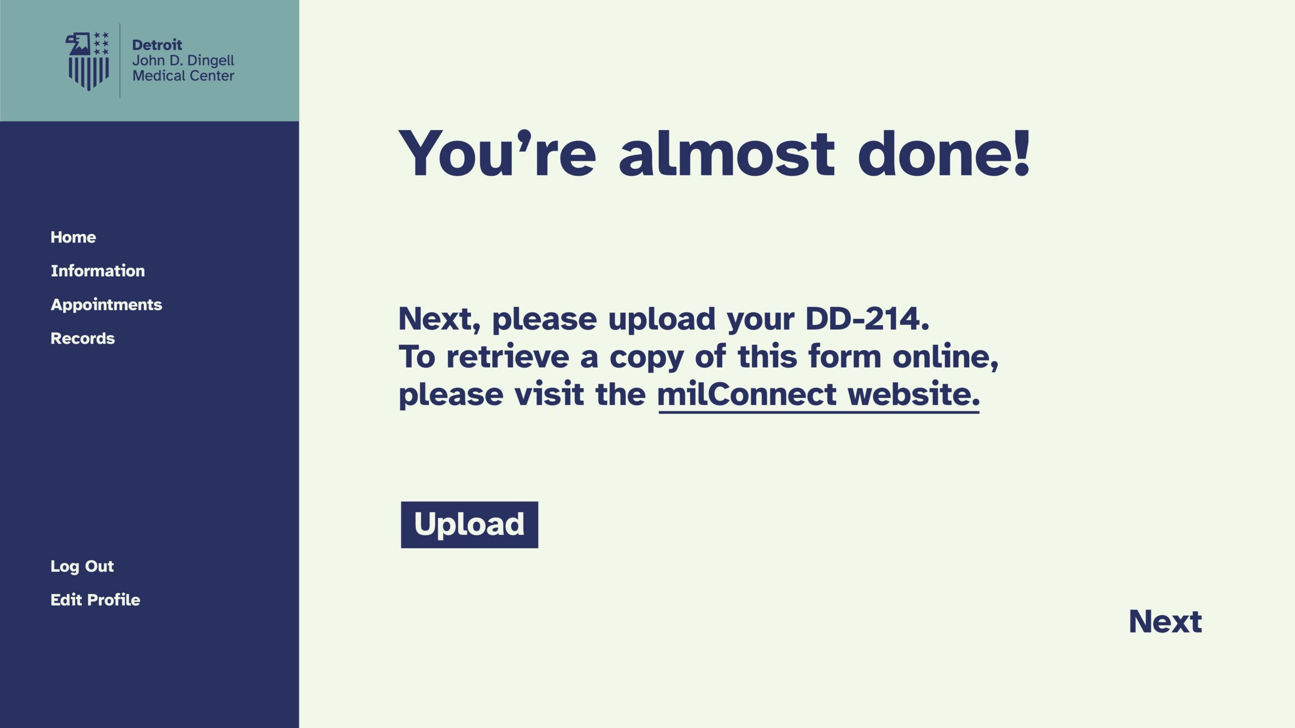
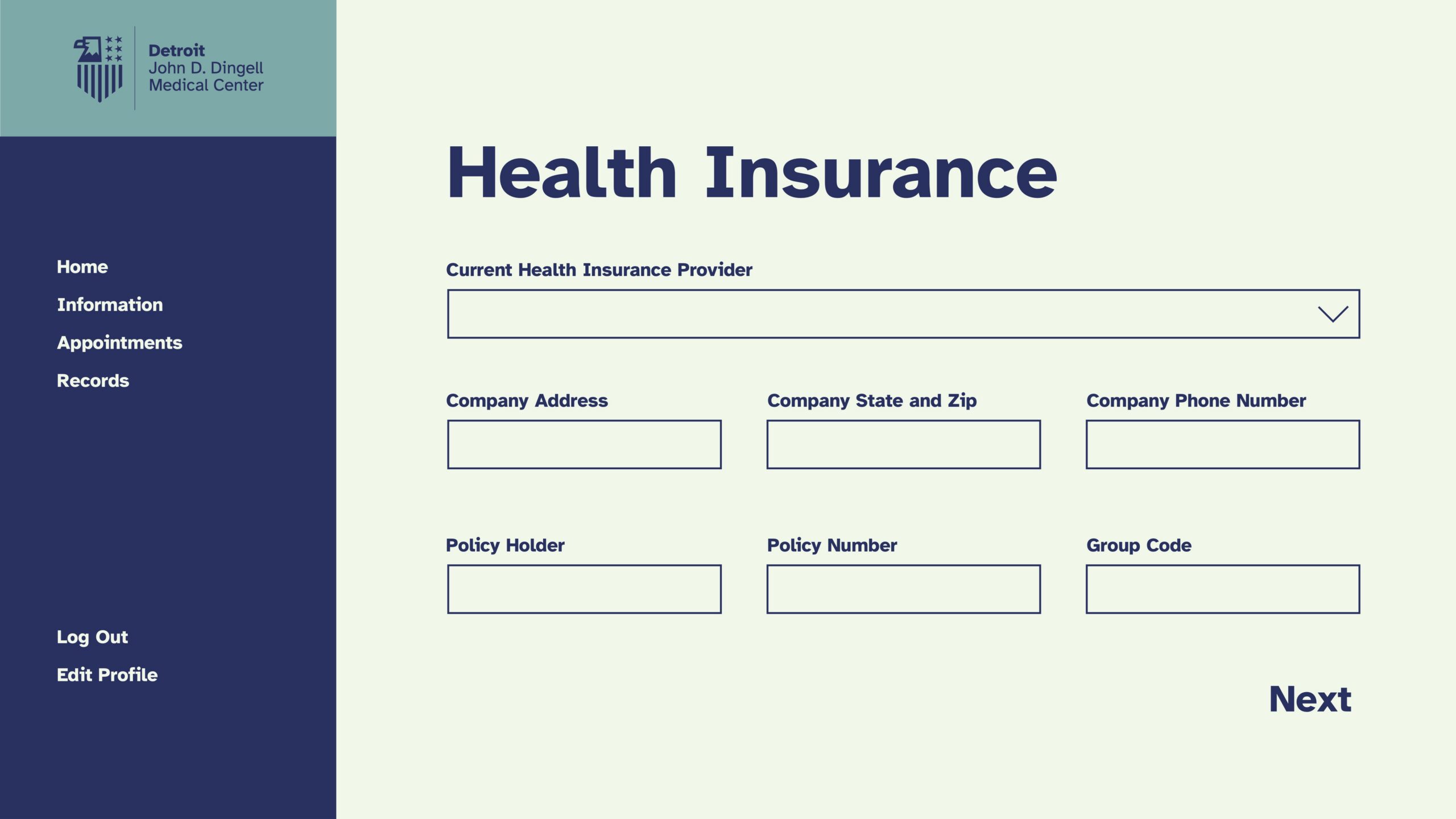
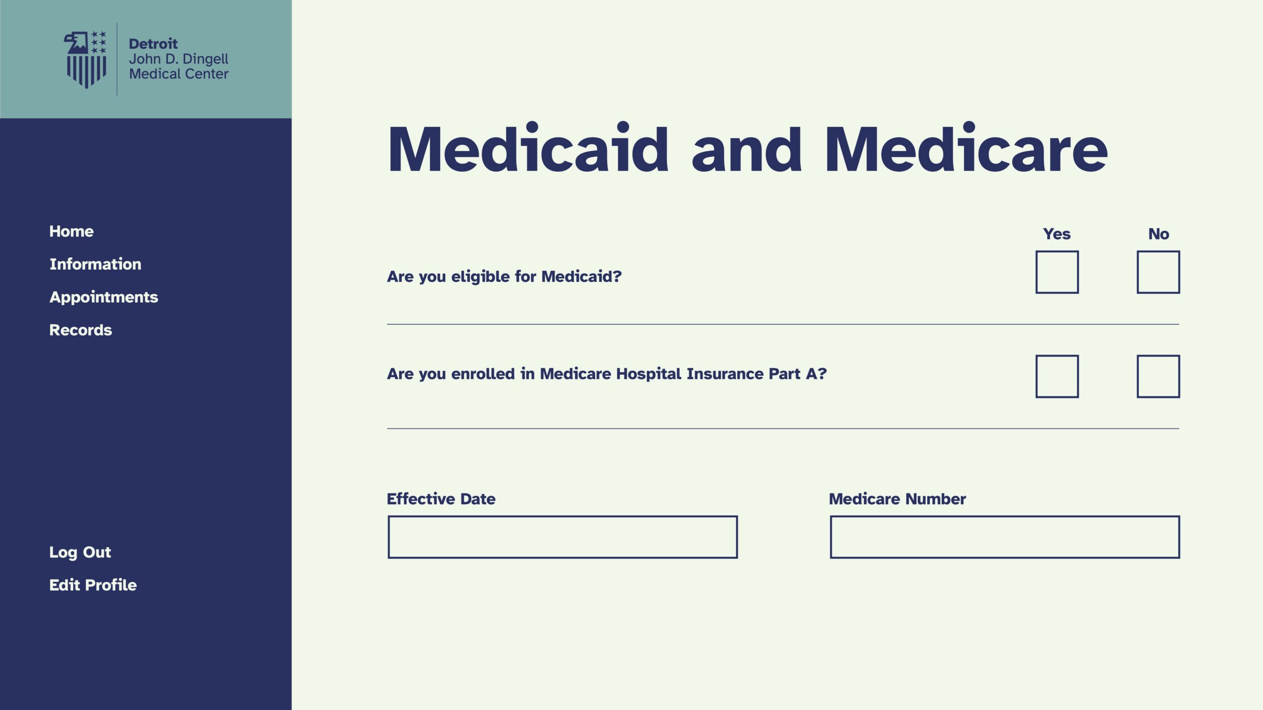
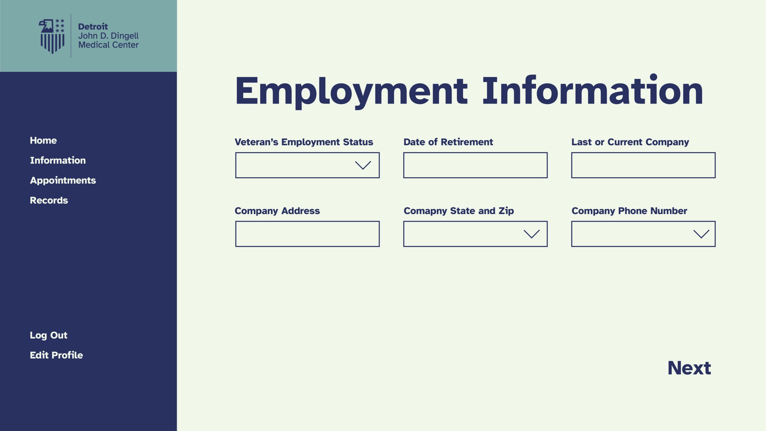
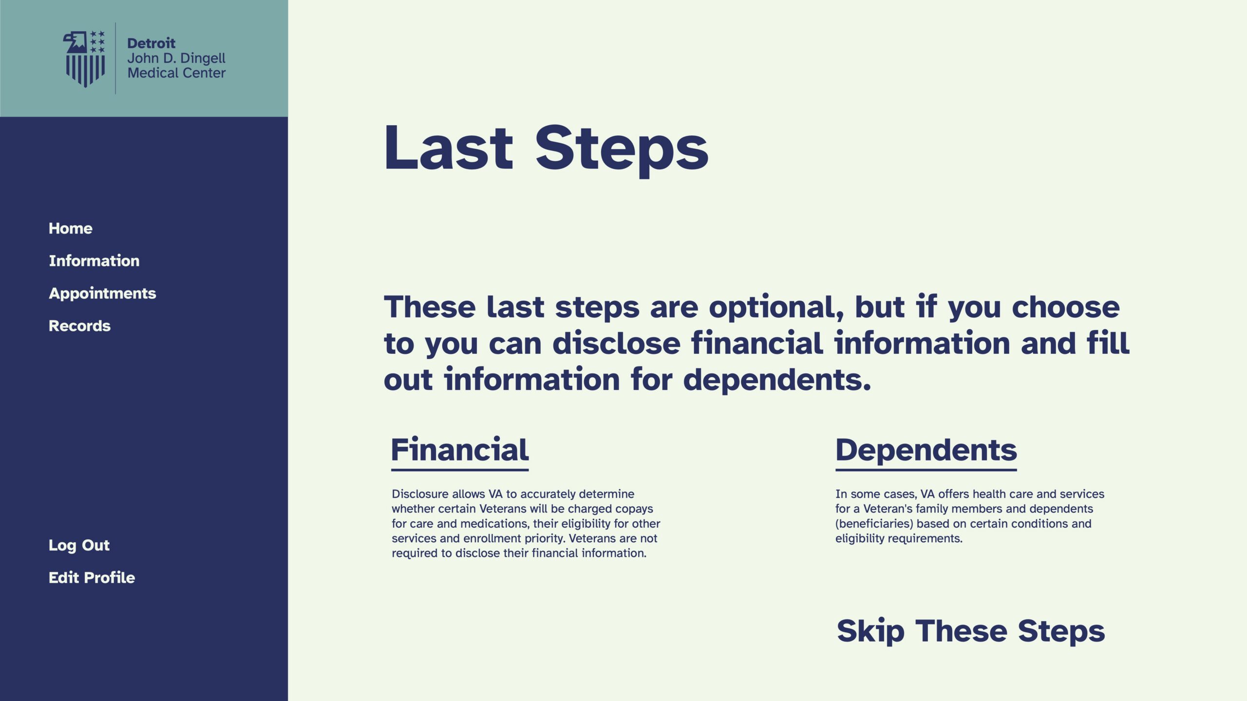
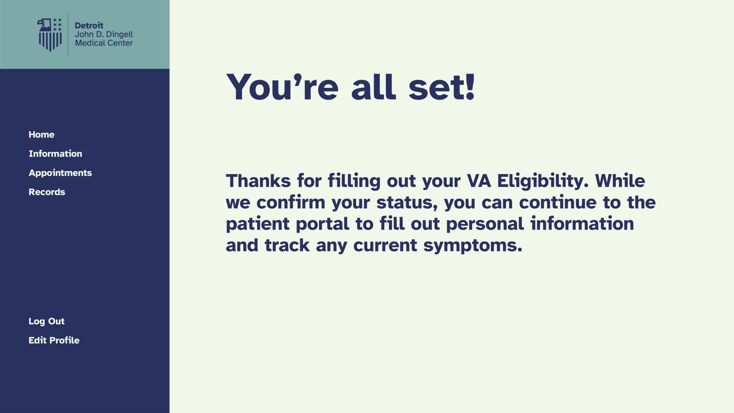
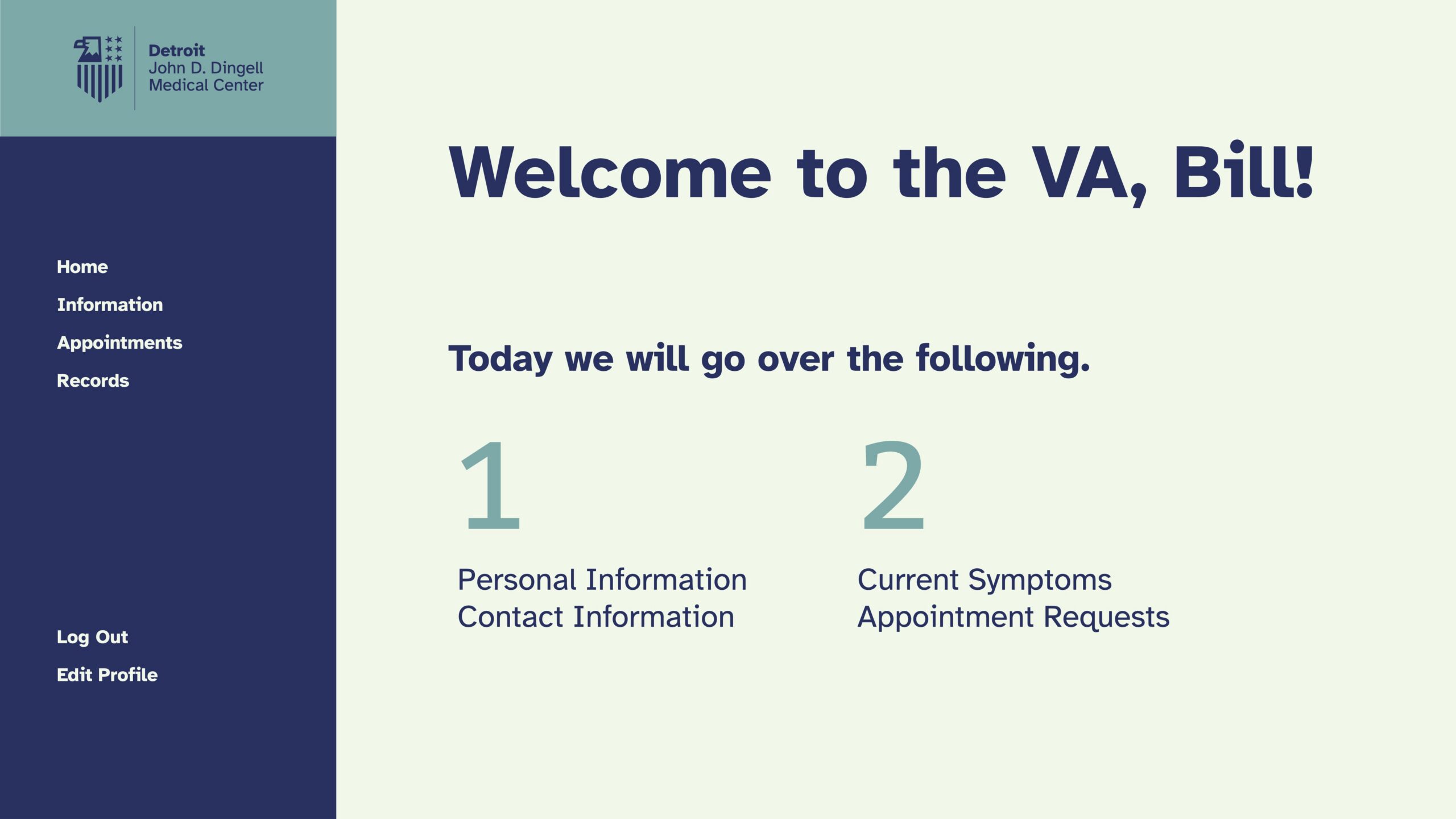
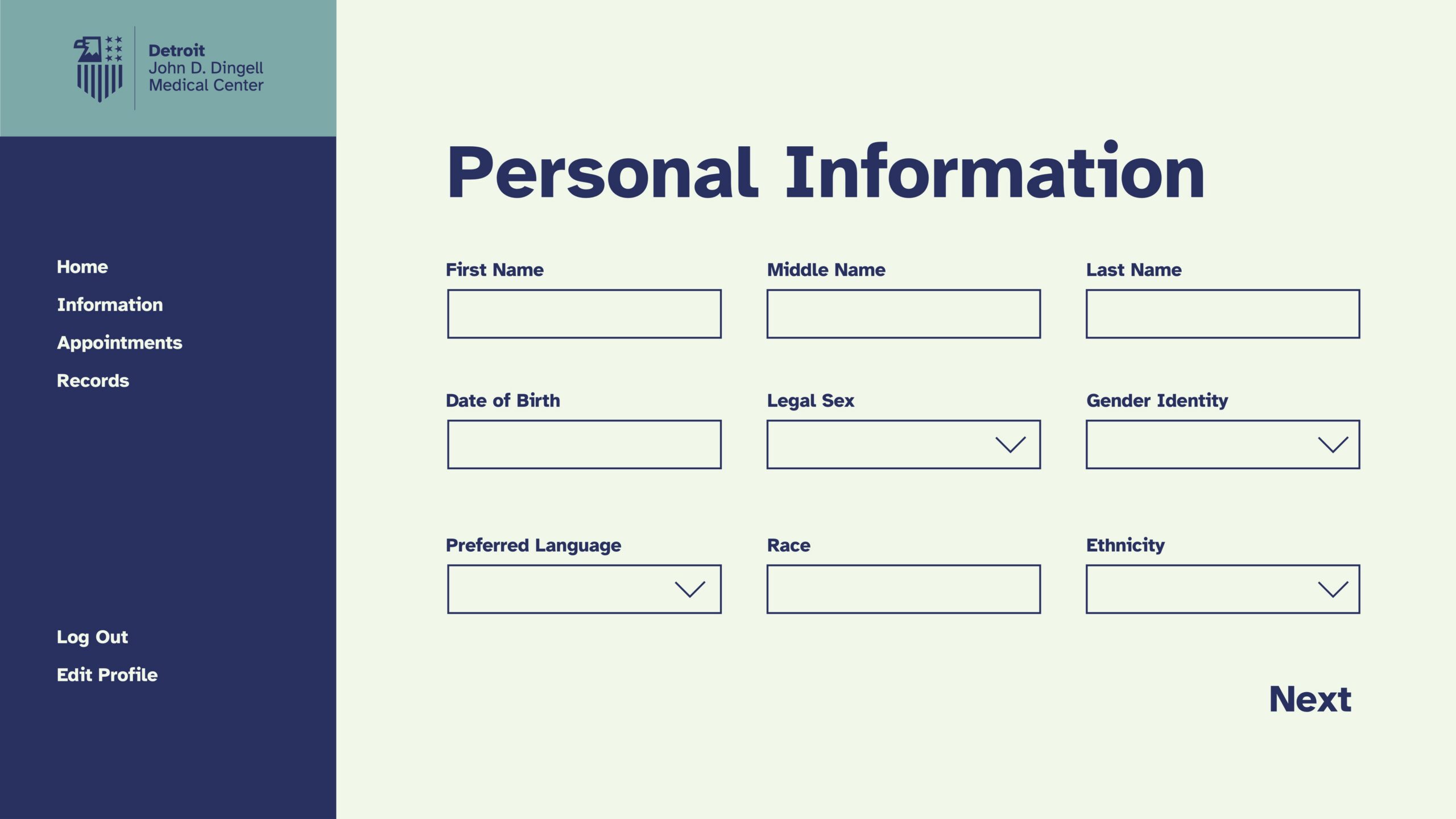
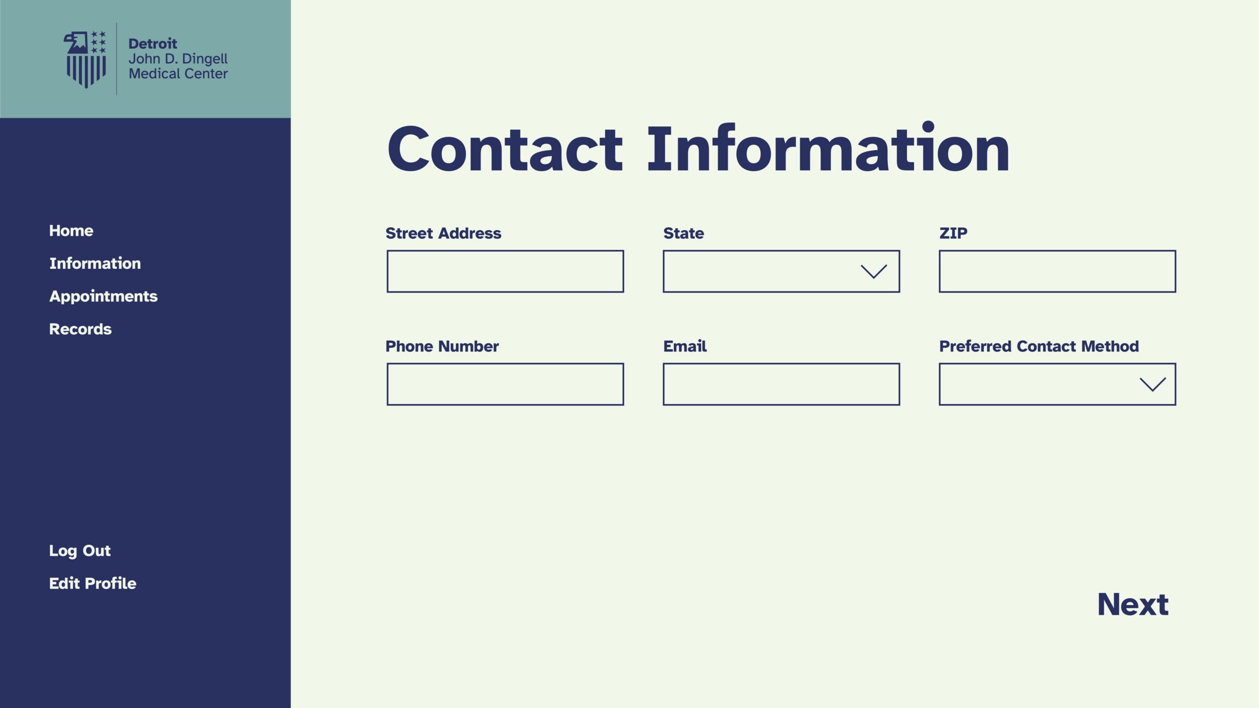
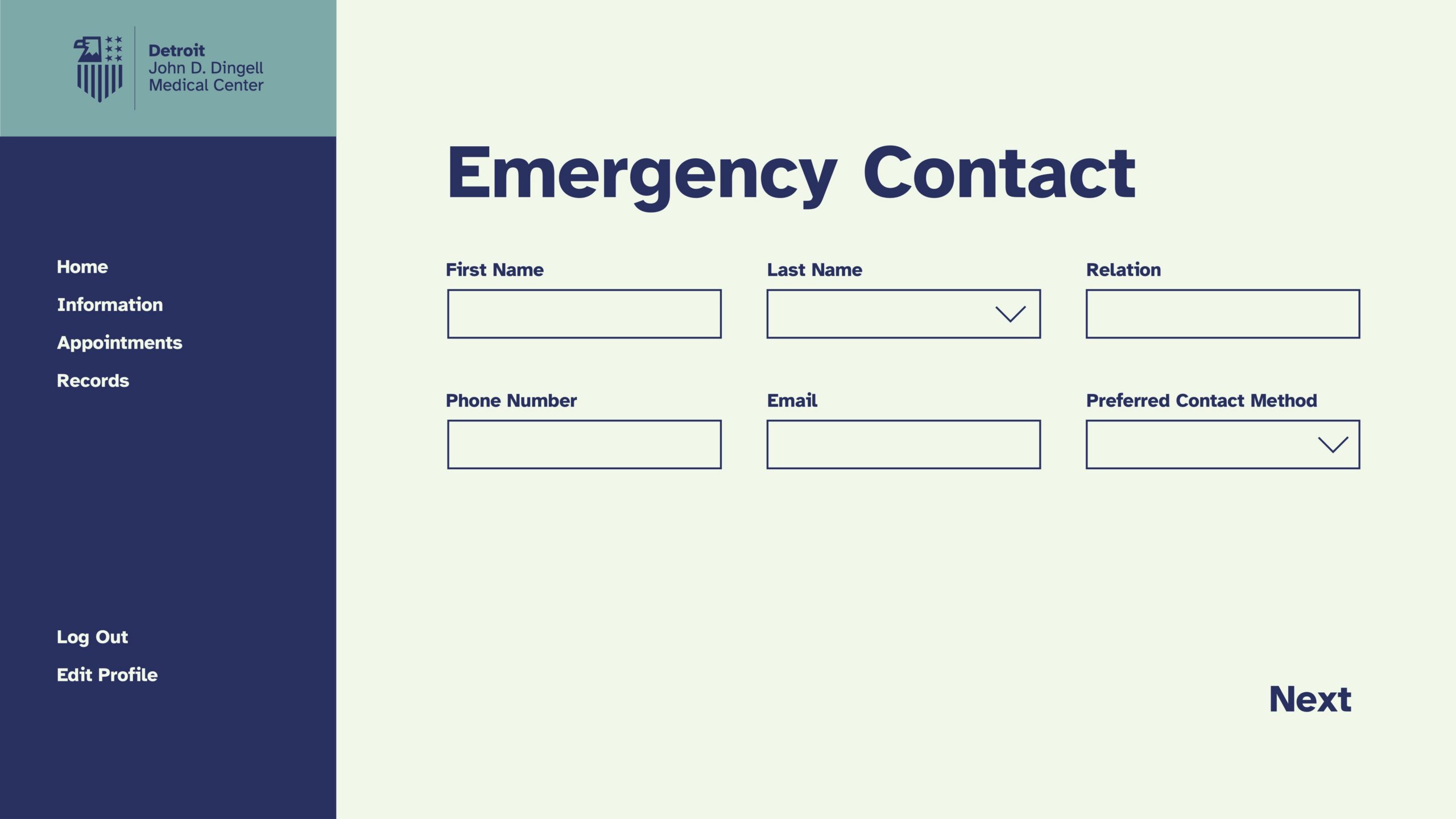
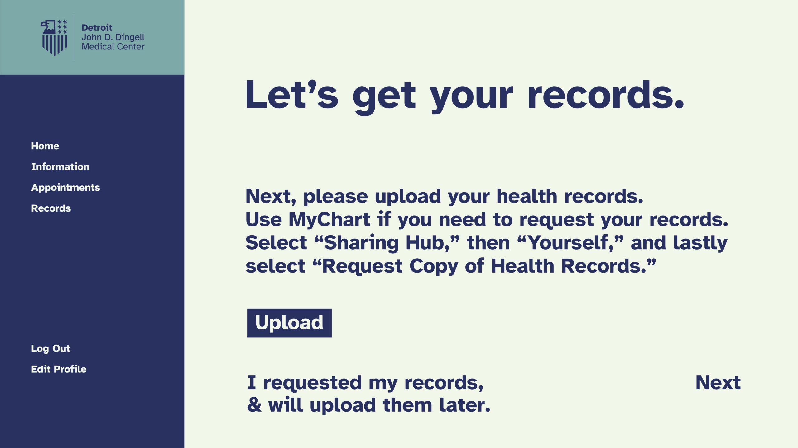
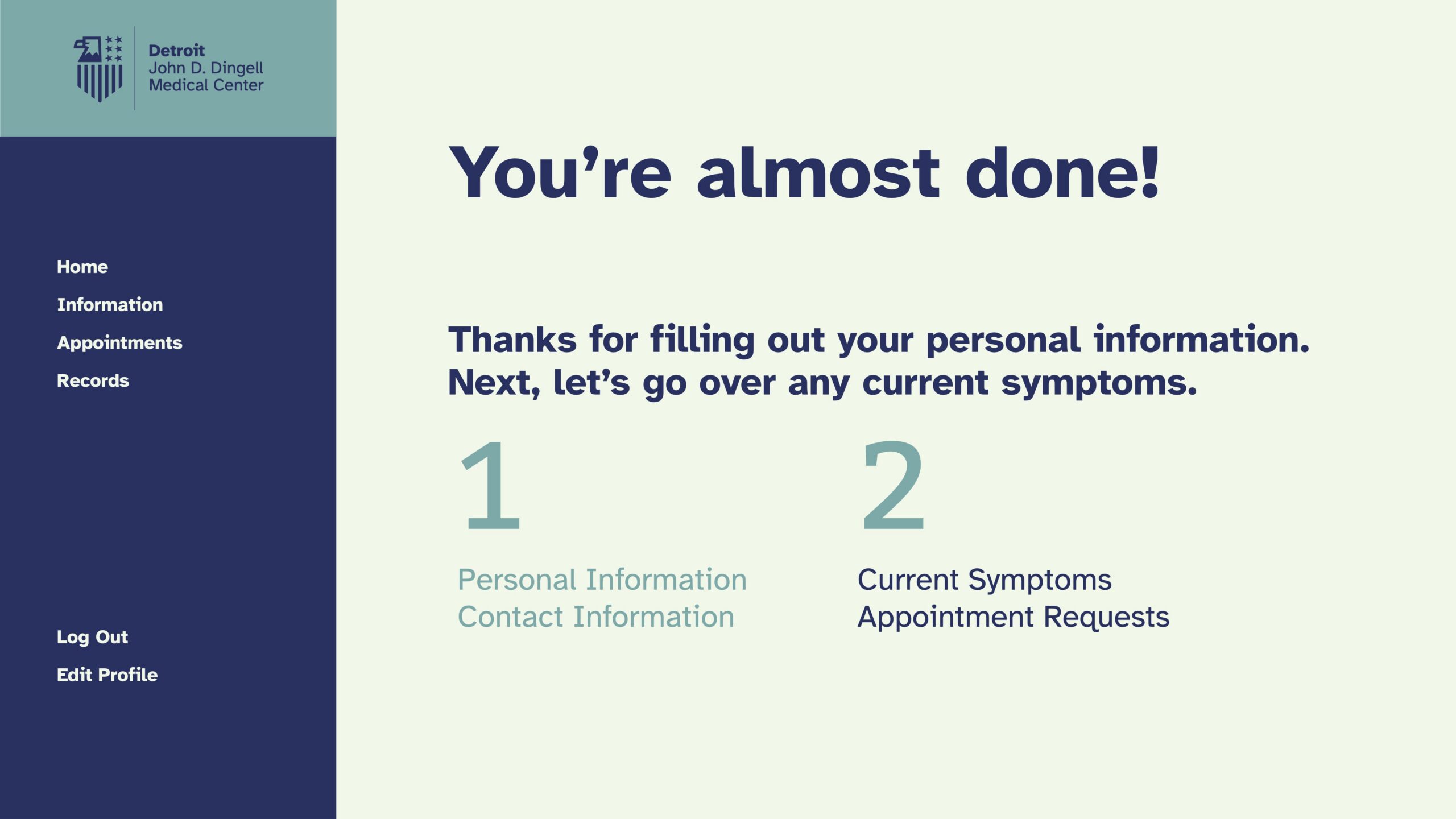
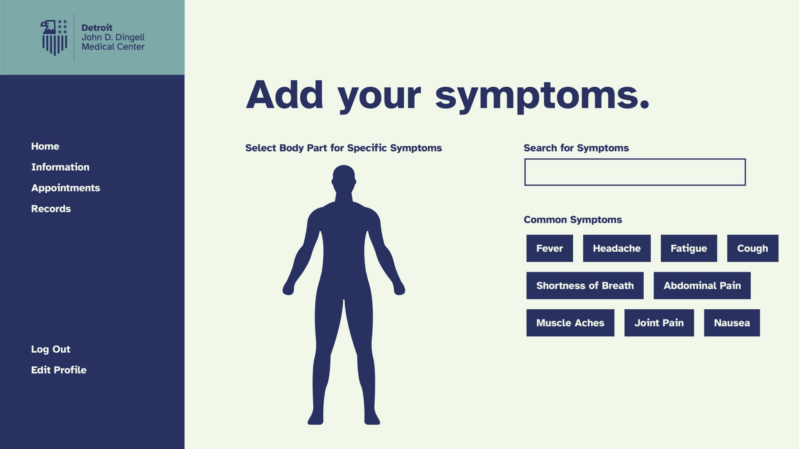
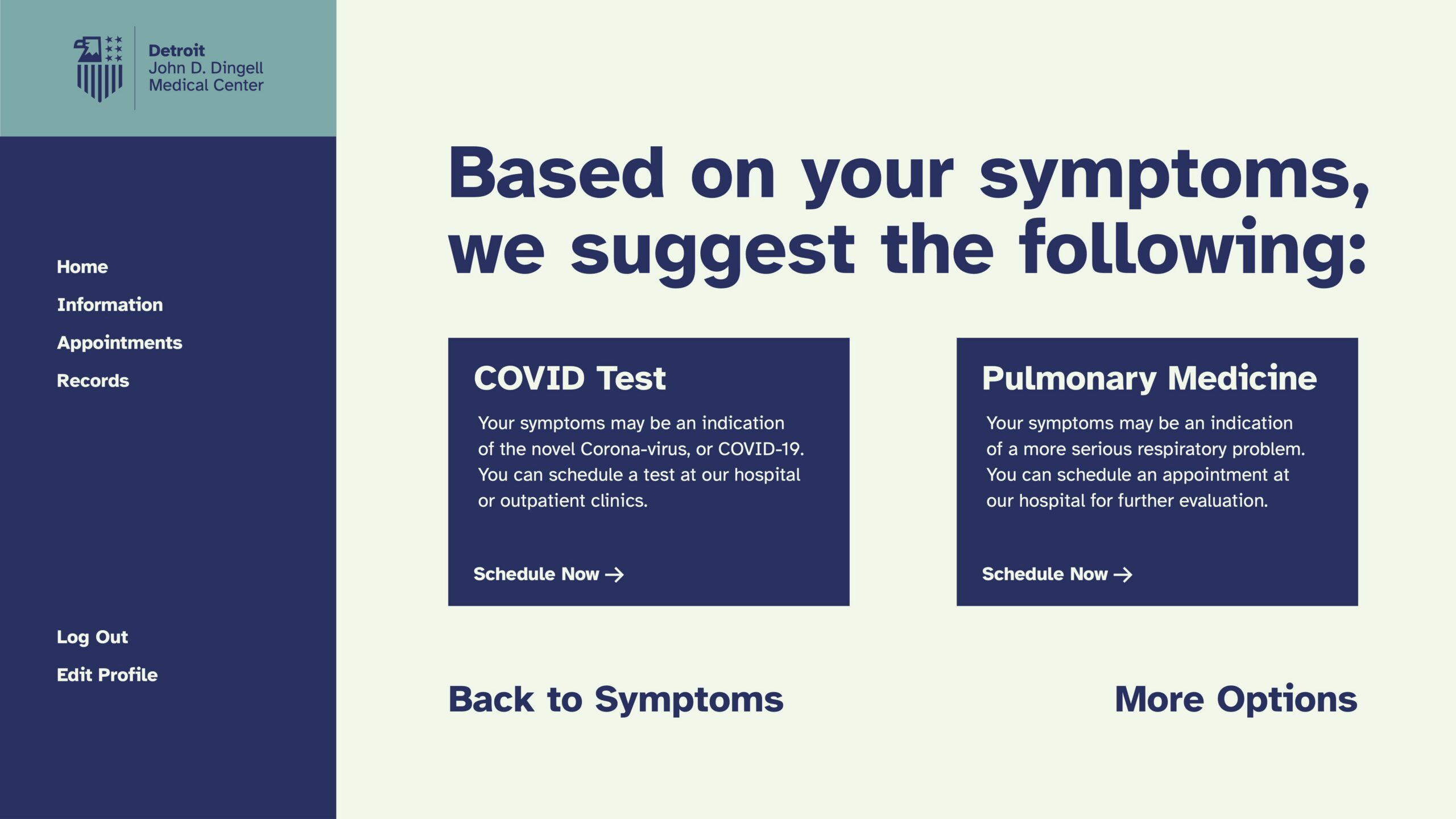
First, we design a VA patient portal, that takes caregivers through the process of signing up for VA services, allows them to schedule appointments, and keep track of their symptoms online. This makes accessing services easier.
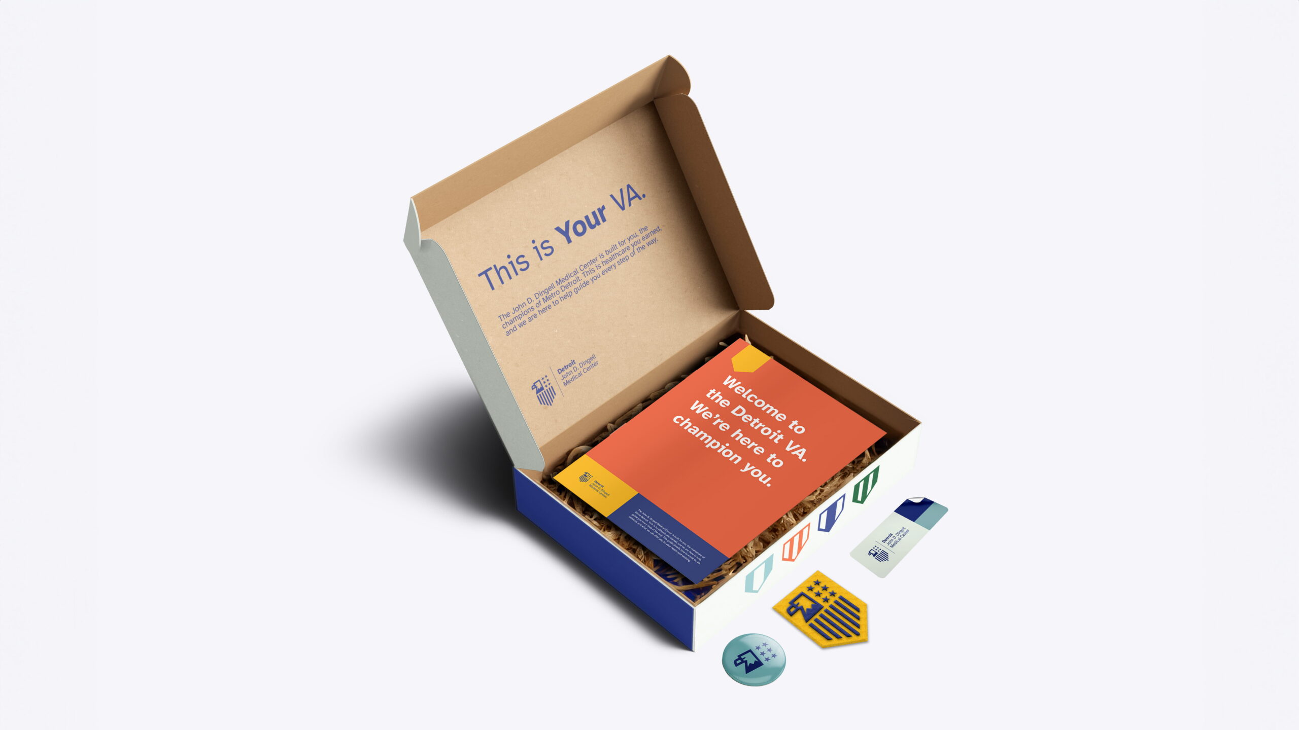
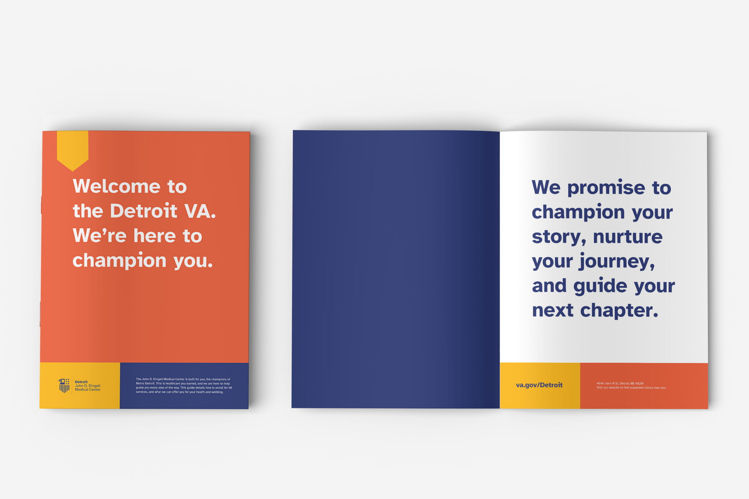
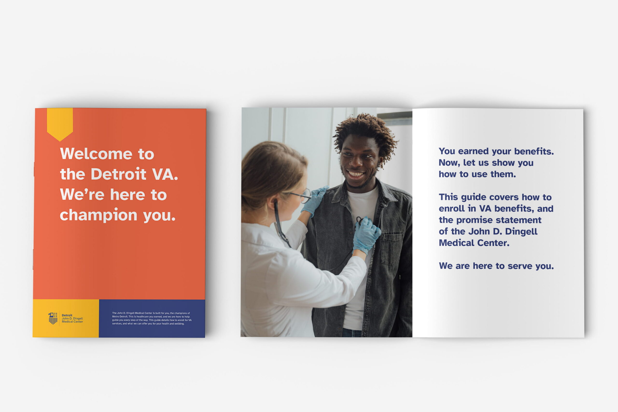
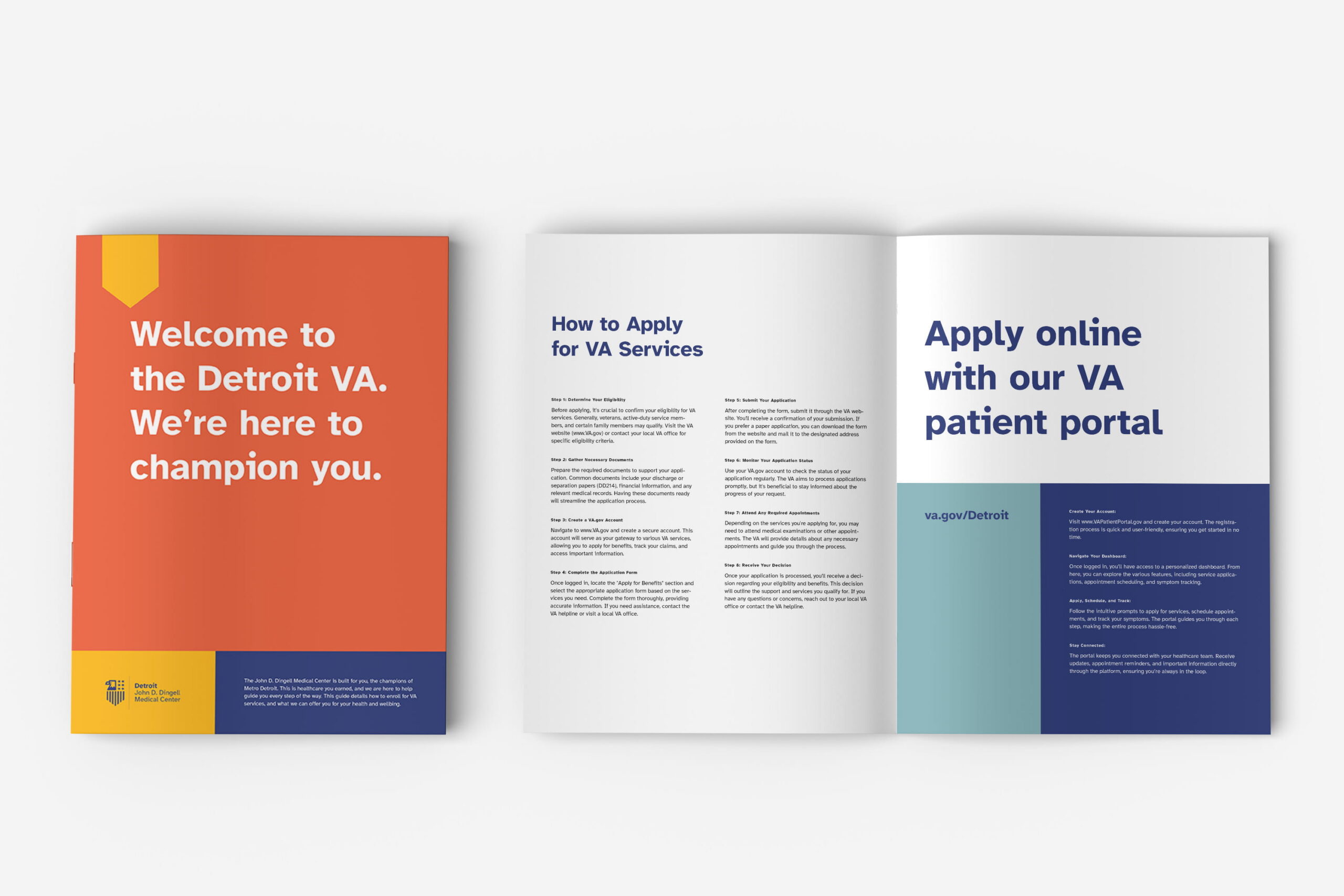
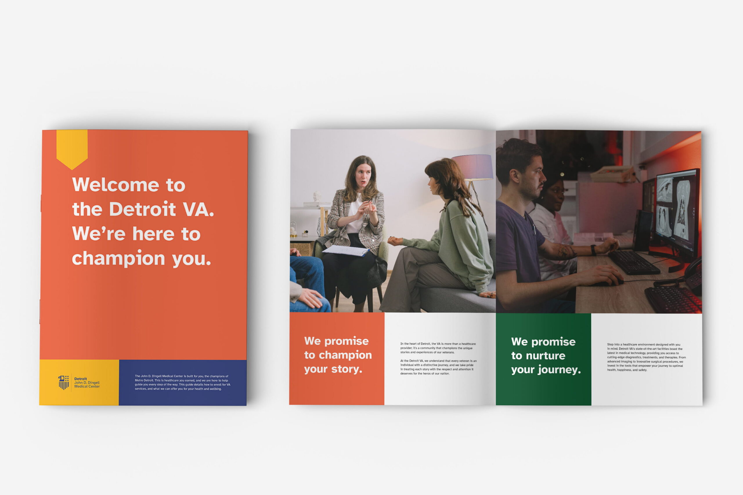
Welcome Kit
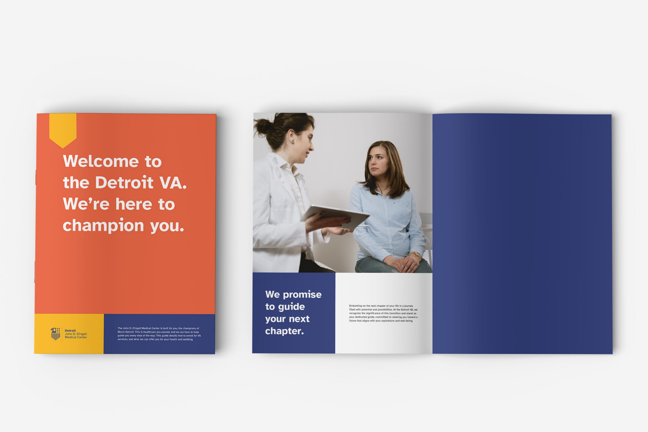
For new veterans, we designed a kit encouraging them to sign up for VA services. With a guide that outlines how to apply for services, and what the VA provides.
Mobile App
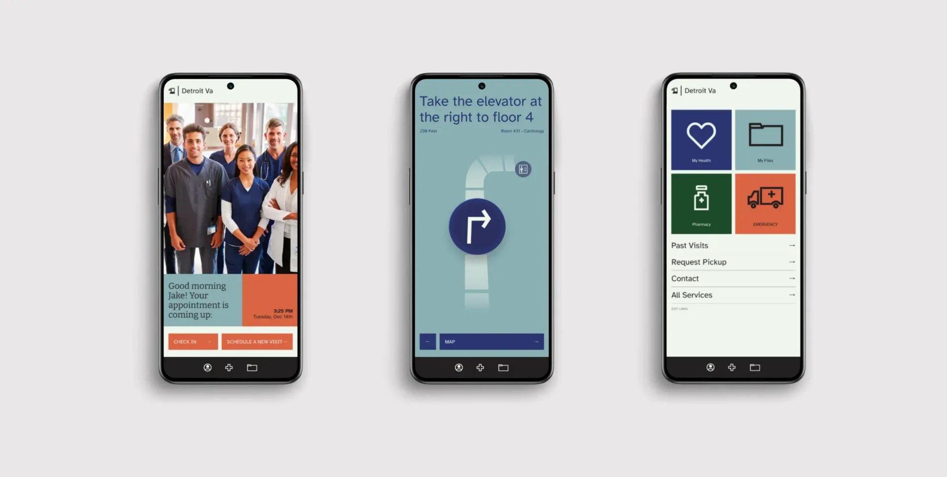
We also designed an app to help aid with navigation and managing appointments from the convenience of your phone.
Wayfinding System
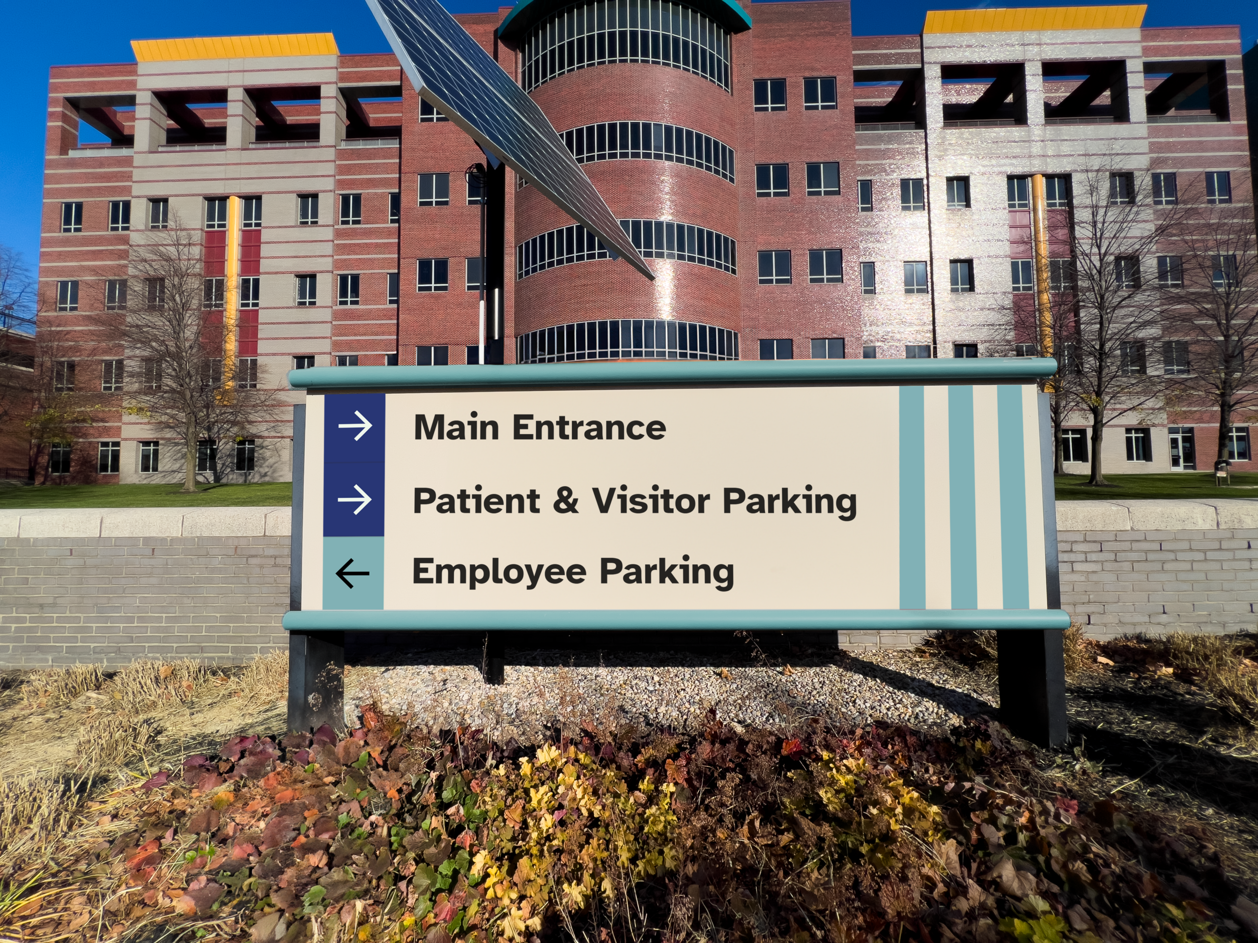
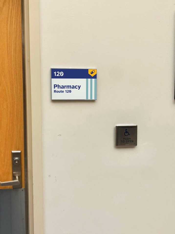
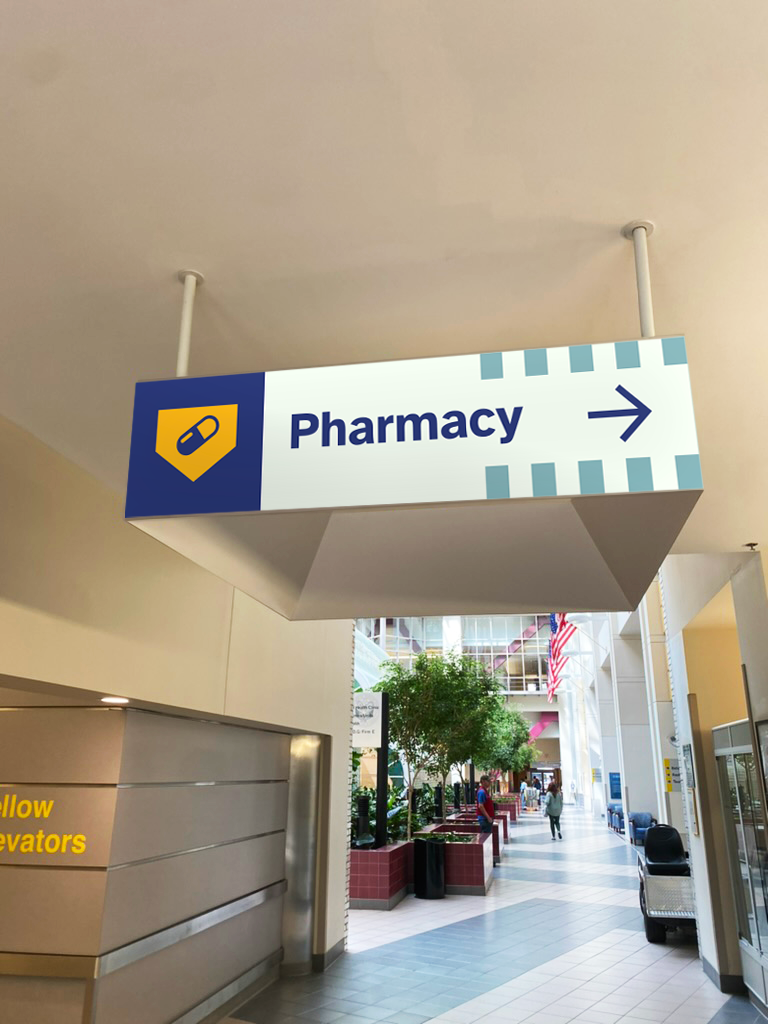
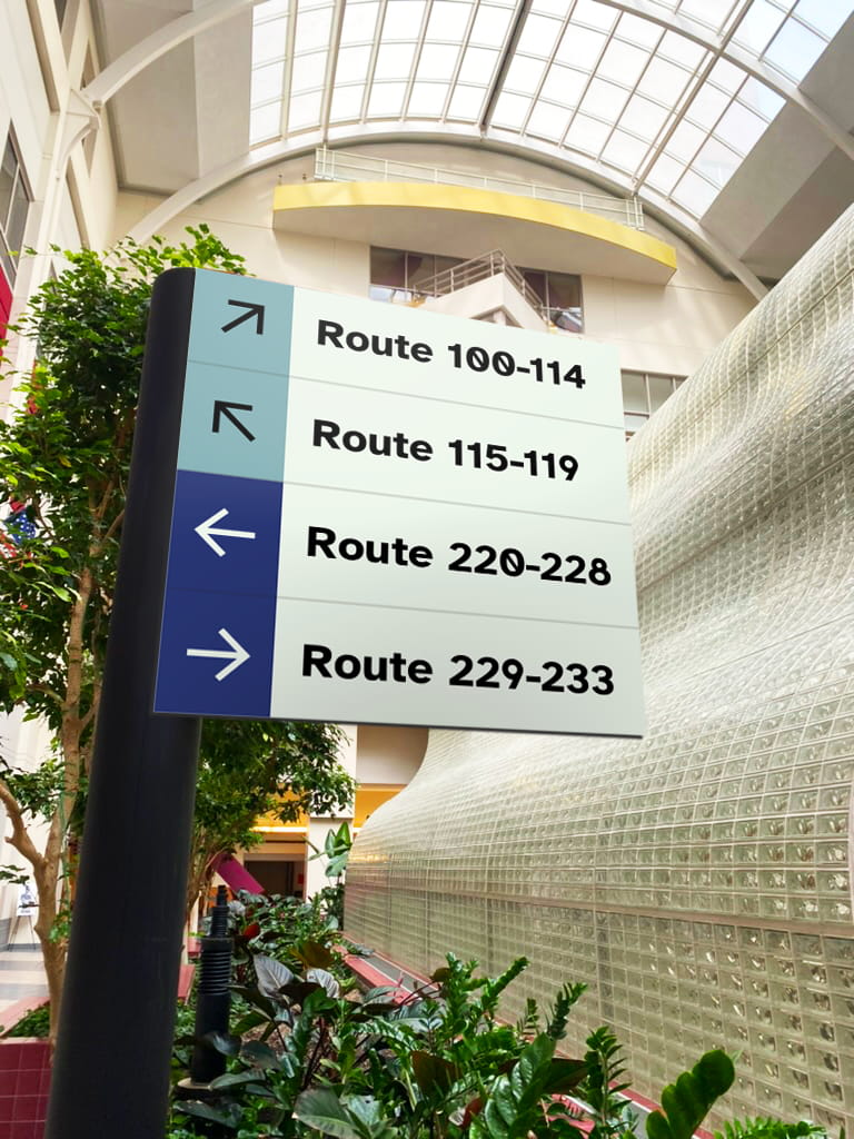
For the hospital journey, we wanted to make sure our designs clearly guided patients. We chose to use a route system for navigation since it can be easily used by colorblind patients. There is clear organization, and the system is scalable in the event of an expansion.
Social Campaign
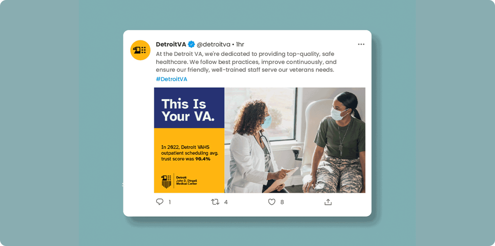
For external applications, we wanted to present the VA as a community pillar that champions veterans. We created a campaign to attract new volunteers, as well as updated social media templates to create consistency across platforms.
Overall, we wanted to create bold brand applications that nurture and guide the community through the VA.
We recognize rebranding a federal agency that cares for so many people is an outstanding task, and we approached the project with the utmost respect for the history of the VA, and the veterans that utilize their services. Our rebrand does not forget the past, but rather elevates it to help guide the VA into the future and create a welcoming space for all veterans.